House Tours

House Feature - Lauren Gordy

I discovered Lauren through Instagram & reached out to her to see if she would be up for sharing her home with us all on the blog. A few months later, here we are! Get ready to see a wonderful space that has been carefully curated. 

Her dog Acorn is ready for the tour!

Her dog Acorn is ready for the tour!

"I am certified in interior design and as of now I help friends and family style their homes. I am working on moving forward with an interior design business. My husband and I live in Wilmington, NC with our 3 rescue dogs; Noah, Elvis, and Acorn. In addition to sprucing up our home and interior design, we own a video production company. We work from the Tin Roof (our home) so it can be difficult to concentrate while thinking of all the things I could be rearranging and adjusting around the house. Hah!"  I also have a studio space where I paint in our home so I can totally relate to what Lauren is talking about.

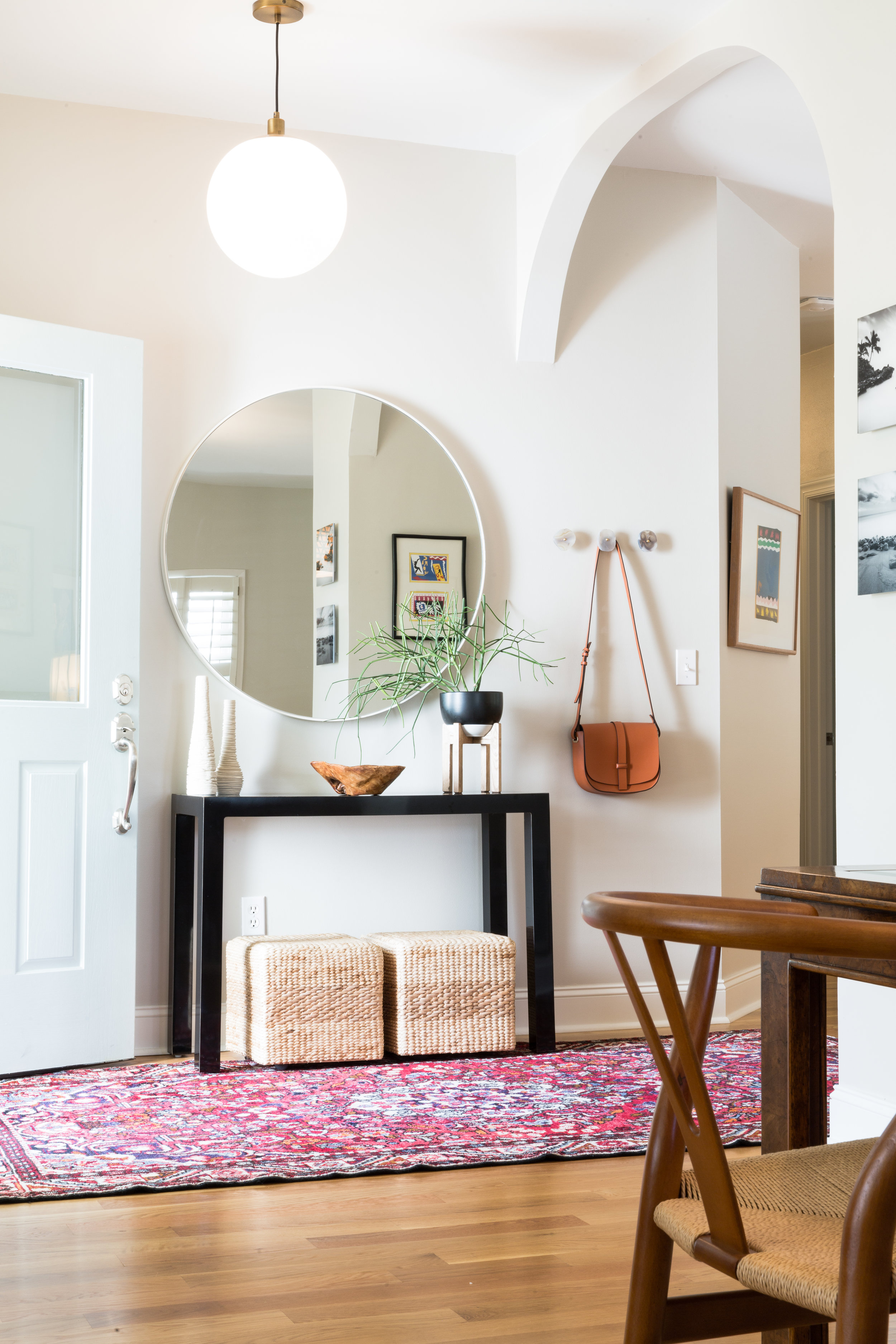
Even though the entrance is small, Lauren has given it so much personality. The addition of agate drawer knobs on the wall create a spot to hang your coat or purse. Lauren's Uncle made the wooden console & the mirror from Home Goods is the perfect focal point. The main living space is an open floor plan & can be seen from many angles, keeping things simple & uncluttered in the foyer helps with the flow.

A pop of colour is added in the dining room with the addition of a bench. I love the oversized cacti print. "From southwestern flare to Persian rugs, I am truly inspired by all types of design and I love to sprinkle a little bit of everything throughout the entire home."

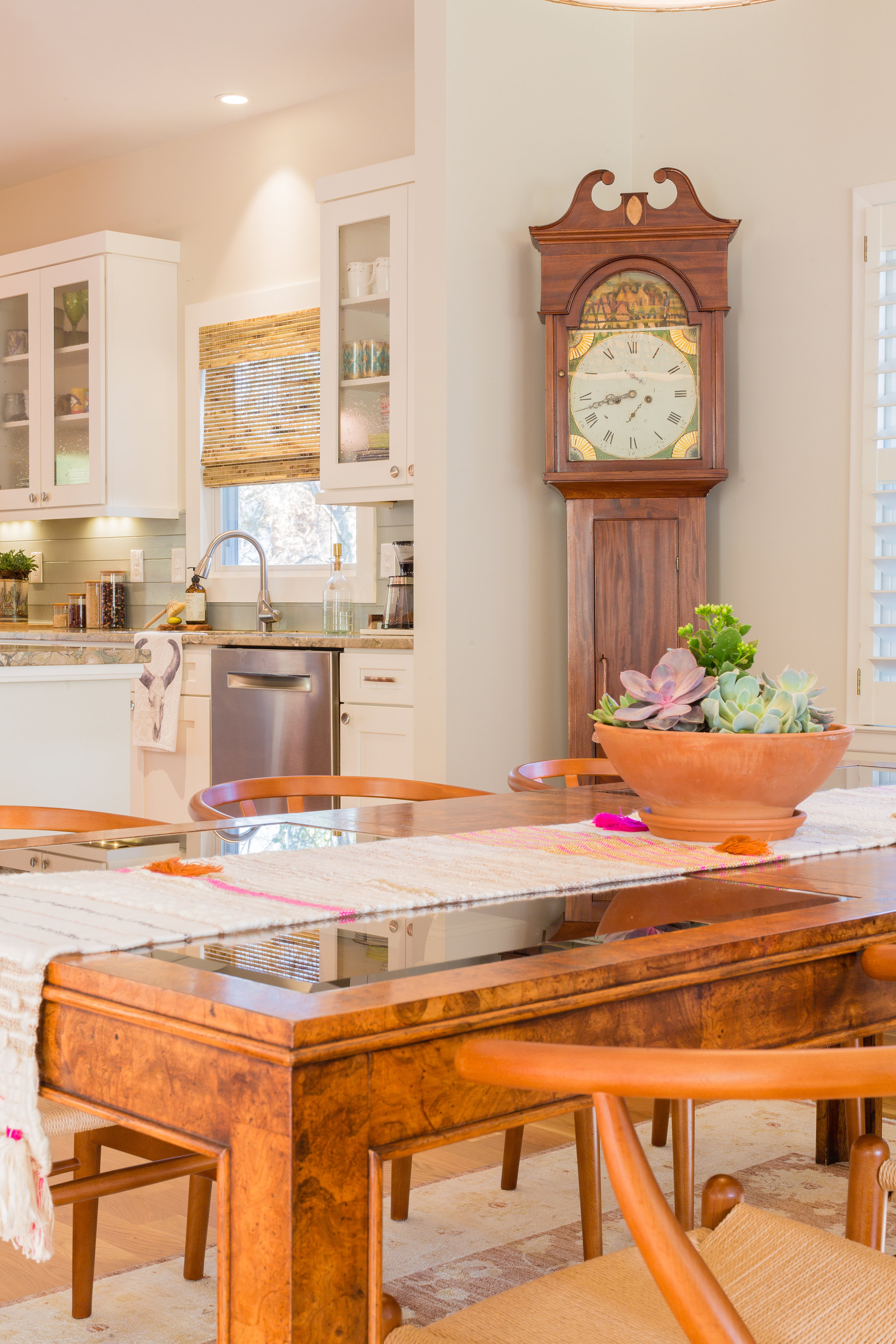
"The grandfather clock was my grandparents. It was made in 1816. We just recently got it working again. You can here it tic tock throughout the house...It's pretty special!"

"The grandfather clock was my grandparents. It was made in 1816. We just recently got it working again. You can here it tic tock throughout the house...It's pretty special!"

Lauren & her husband were lucky to find a home that didn't require any major renovations. The previous homeowners did a fantastic job on the kitchen. Considering that they only moved into their house last August, Lauren has done an incredible job making it feel like a home.

"We love our little eclectic home. It is surrounded by palm trees, succulents and beautiful foliage.  We are a couple miles from the beach, so it is nice to step outside and smell the salty air. Our outdoor space with the sunroom, back deck and pool, is the perfect little oasis to entertain friends and family! And of course, let our 3 pups run around and play."

This shot allows you to see the open floor plan. I'm so jealous that they can cook & watch tv at the same time! When they moved in they repainted and changed the light fixtures & blinds. Easy fixes for anyone who wants to add their own personality to a space.

Lots of comfy cushions create a welcoming spot to cuddle.

Lots of comfy cushions create a welcoming spot to cuddle.

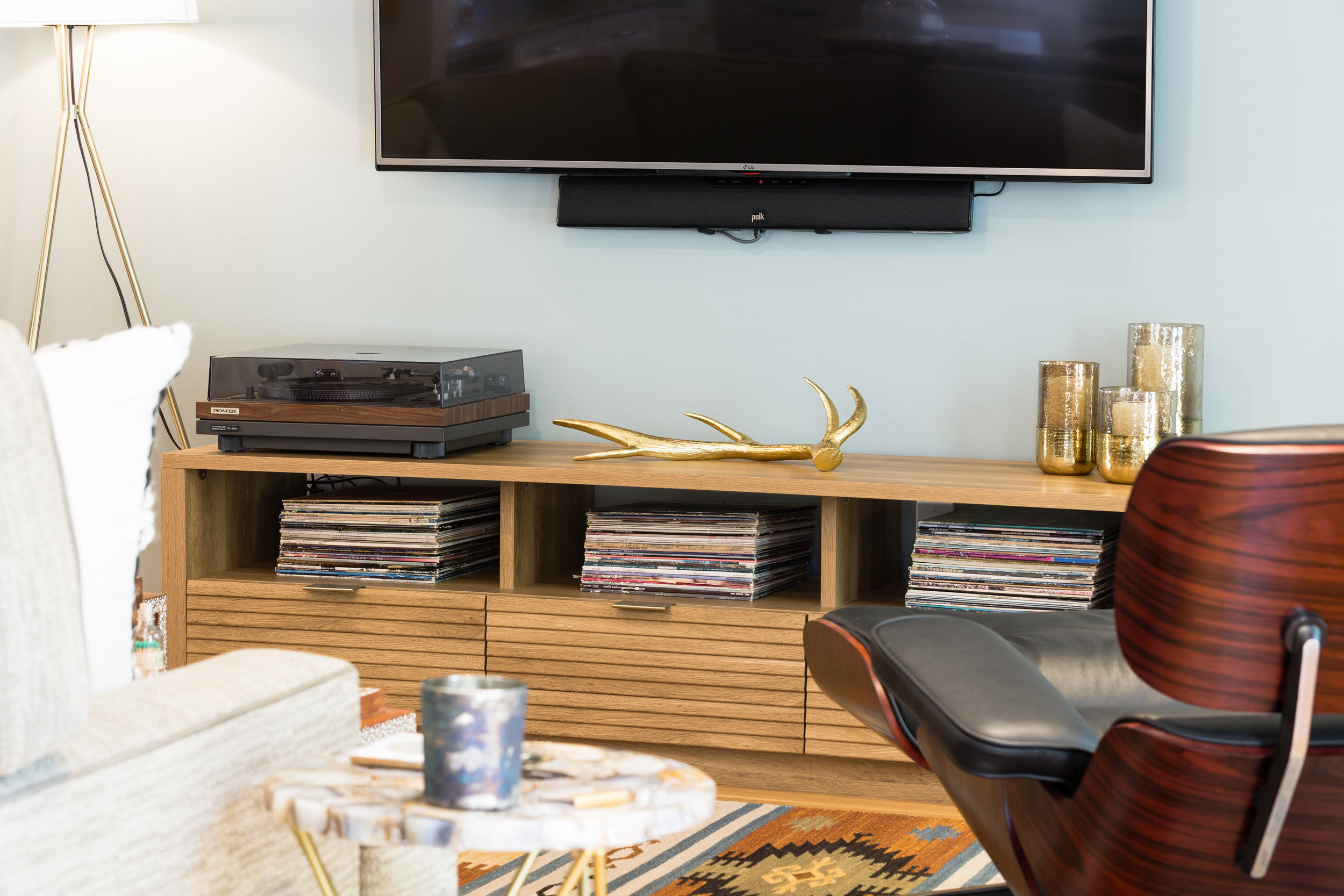
"The record player was my father in laws and he generously gave it to us when we moved in. We have a ton of great records but my favorite is Fleetwood Mac for sure!" I also listen to a lot of Fleetwood Mac in our home, so I think we would hit it off. She has good taste folks.

The master bedroom is kept neutral with lots of texture. How stunning is this bed from Anthropology!

The master bedroom is kept neutral with lots of texture. How stunning is this bed from Anthropology!

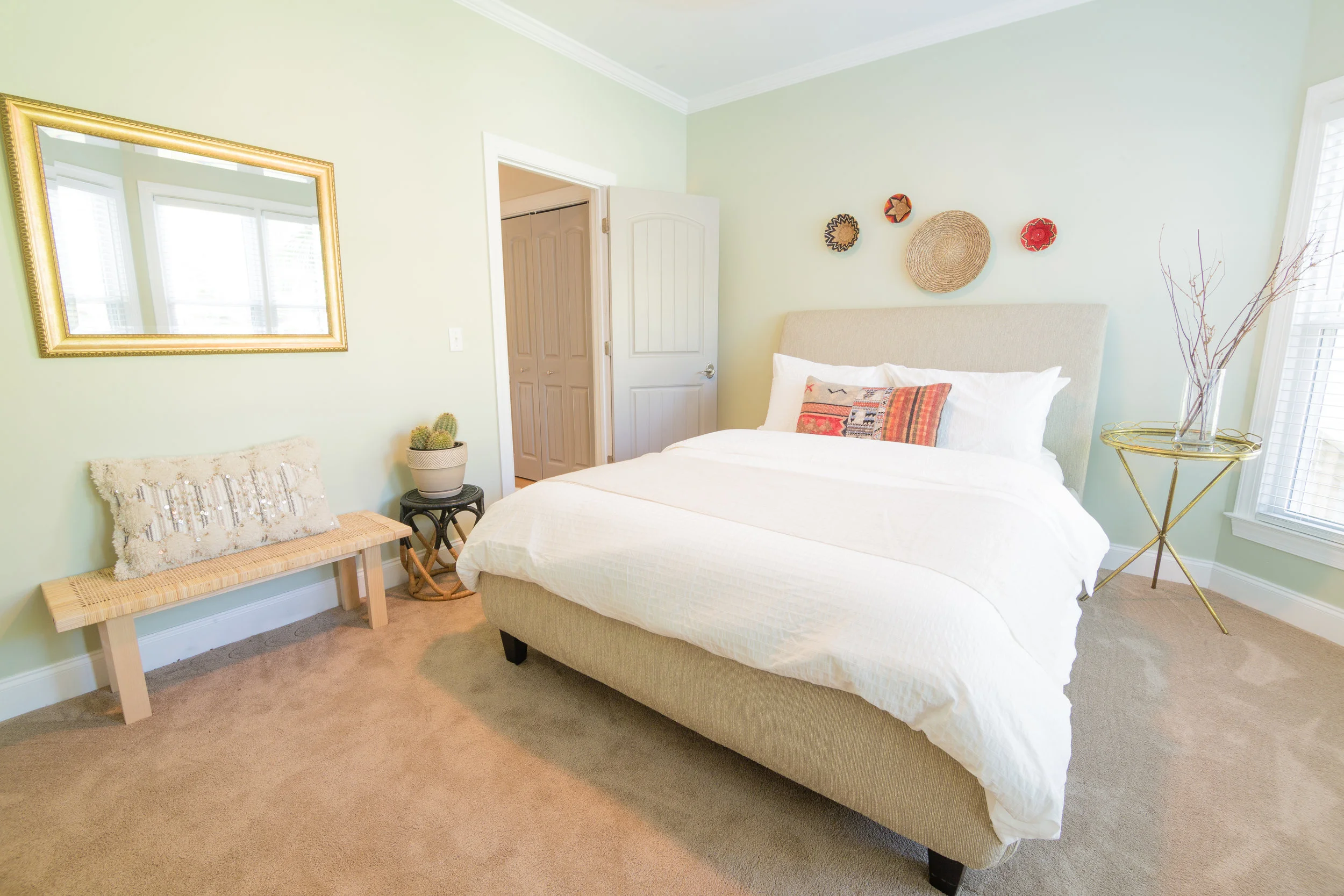
The perfect spot for guests to relax and spend the night.

The perfect spot for guests to relax and spend the night.

"My favorite room in the house is the living room. The room has large bay windows that bring in a ton of morning light. We love to sit in there each morning, drink our coffee, chat and hang with the pups. It's a great way to start the day."  

I love how Lauren has incorporated plants into the vignettes throughout her home. They really are an inexpensive element that adds a lot of character.

I love how Lauren has incorporated plants into the vignettes throughout her home. They really are an inexpensive element that adds a lot of character.

Our living room area rug is very similar to this pattern (my husband even noticed that) good choice Lauren!

Our living room area rug is very similar to this pattern (my husband even noticed that) good choice Lauren!

No corner is left untouched. Lauren has styled every inch of this home to perfection.

No corner is left untouched. Lauren has styled every inch of this home to perfection.

"I will forever love interior design and helping others turns their house into a home. It’s definitely my passion." Thanks for sharing your home with us Lauren, & I know you are going to succeed with your new business. 

Boho House Feature

When I first joined social media I was surprised to see how many other people shared my love of thrifting.  I remember a piece of art that caught my eye in Jo's space & it turns out it is her favourite element that welcomes you into her home. Every time someone sends me photos of their home to feature I get excited.  I have a sense of what style they gravitate towards, but the full tour is like icing on the cake. Jo also lives in Ontario, only a few hours from me. Maybe in the New Year we will have the chance to meet up and go shopping together. When she shares her latest finds on her instagram account, @jmwearing, I totally feel like she is the Canadian version of Emily Henderson. When you see her home & her styled shelves you will agree with me. She's got mad thrifting skills y'all! 

"Holly and I recently connected this year on instagram after finding a mutual appreciation for amazing art and love of décor – bonus points for being a fellow Canadian!  She asked me if I would be willing to participate in a home tour and I jumped at the idea. I have always wanted to start a blog, but am unsure if I could commit to do it, but knew this would be a really fun experience!  My boyfriend and I live approximately 40 minutes north of Toronto, where we purchased our home a little over a year ago.  I work in the financial sector where my creativity tends to be put on hold, so my home is where I am able to fully let it go."

"One of my favourite items in this room is my framed Art Gallery of Ontario poster from 1988 of Andy Warhol’s Elvis I and II (1964), which was produced for an exhibit. I scored this off of eBay and had it professionally framed.  I love this little nook as it adds a big impact when you first walk into our house because it’s one of the first things you see."

"Our home was built in 1987, and is your standard cookie cutter subdivision home, which meant adding personality and character would be done through the decorating!  I tend to live for everything and anything vintage or thrifted. I have no idea where this came from – I only started going to thrift stores over the past 2 years, but I haven’t been able to stop.  There is something weirdly soothing about walking through the aisles of thrift stores. I love looking at items and wondering who the original owner was, why they bought the item, and how it ultimately ended up on the shelf in front of me."  

"I have, and continue, to struggle with our ‘L’ shape layout combo of living and dining room. I have a feeling this room will always be changing. The way I accumulate items means I never know what I’m going to come home with and what will change. I always thought our home would be exploding with colour, but I seem to have shifted to a very neutral palette."

This unique coffee table was one of Jo's latest finds. I love how she layers texture into her space and adds pops of colour with greenery.

This unique coffee table was one of Jo's latest finds. I love how she layers texture into her space and adds pops of colour with greenery.

Mid Century pieces are what I'm drawn to as well. This thrifted chair needed sanding & staining & looks great with updated upholstery.

Mid Century pieces are what I'm drawn to as well. This thrifted chair needed sanding & staining & looks great with updated upholstery.

I just want to invite myself over for dinner. I would stare at the photography for hours!

I just want to invite myself over for dinner. I would stare at the photography for hours!

"When my boyfriend and I first started dating we took a weekend trip up to his family cottage. In the basement, was the most beautiful antique harvest table I’d ever seen. And coming from a mid century modern fan – I knew this table was something special. I remember making a mental note about how this table needed to eventually make it with us where ever we went.  When we moved into our house, the universe honoured my vibes and the harvest table came with us! The table originally came from my boyfriends grandparents farm and is loaded with character – boards that are starting to curve and plenty of nicks and burn spots – but I wouldn’t change a thing."

"I knew we needed to keep the rest of the finishes pretty modern so that the harvest table didn’t go too rustic. The eiffel chairs and industrial chandelier were easy choices. The picture shelf concept, four in total from IKEA, came from some Pinterest images I had stumbled upon. I was looking for an easy way to differentiate the space between the family room and dining room since it is one big ‘L’."

"The shelves have been mostly filled with photos from thrift stores, antique shops, and eBay. My favourite of the bunch is a small black and white photo my dad took with his brownie camera of the kaleidoscope pavilion from Expo ’67 in Montreal."

"Our master was one of the easier spaces to put together. Prior to us even having a house, I had a bad (…or maybe good?) habit of buying furniture and stashing it away in my parent’s basement.  I think at the time everyone thought I was crazy, but I would tell them that if I loved the item I would make it work in whatever space I ended up with. Our master bedroom is a perfect example of this.  The end tables ,lamps, and rug were all Kijiji and estate sale purchases that I made while we were house hunting.

"And yes – we are TV in the bedroom kinda people. My dirty secret is out."

"And yes – we are TV in the bedroom kinda people. My dirty secret is out."

"The campaign dresser is one of my favourite pieces in our home. It came from my aunt, whose grandfather or great grandfather either brought it over to Canada from England during the 1800s, or purchased it upon arrival.  I was nervous about how it would work against the mid century vibe of the other dresser, but I think they balance each other out very well."  

The graphic black & white prints above the bed pop against the white wall.

The graphic black & white prints above the bed pop against the white wall.

Someone was throwing out this plant as they thought it was dead.  Jo scored it for free, as you can see it's thriving it her sunny space.

Someone was throwing out this plant as they thought it was dead.  Jo scored it for free, as you can see it's thriving it her sunny space.

"The mid century modern dresser and mirror are vintage – my dad bought this set off of my grandparent’s best friends many, many years ago. This was in my house growing up, and was my first introduction to mid century modern furniture as far as I know. In my early 20s my parents were ready to put it out on the curb. I panicked and begged them to hold onto it. This guy ended up sitting in their garage for 5 years before we finally got our house and went to work refinishing it."

How cute is that rattan rocking horse!

How cute is that rattan rocking horse!

I can't even pick my favourite piece from all these thrifted goodies, there are too many!

I can't even pick my favourite piece from all these thrifted goodies, there are too many!

"About a year ago, we decided the office would work really well with a wall mounted shelving system. I am a mid century modern lover, and have always loved the look of wall systems/Cado set-ups. After looking for what seemed like ages, I finally came across a set off of Kijiji that worked perfectly. They were gorgeous solid teak that had been milled for the original owners in the 60s."

The Danish monkey & that gorgeous hand are high on the list.

The Danish monkey & that gorgeous hand are high on the list.

"Fast-forward to today, after forcing black paint [Benjamin Moore Wrought Iron] on my boyfriend, and the office is complete."

"Fast-forward to today, after forcing black paint [Benjamin Moore Wrought Iron] on my boyfriend, and the office is complete."

"This room really came together after I spotted the peacock rattan headboard at a local thrift store. At the time, I had a rusted out 1997 Toyota Camry and prayed this guy would fit the backseat. Once it was put up, my mind was pretty set on what I wanted in here. It has gone through several different versions, but I think the current one will stick for awhile!"

I would love to be a guest in this space, how cute is the elephant! We have a lot of teak in our home, the style is timeless in my opinion.

I would love to be a guest in this space, how cute is the elephant! We have a lot of teak in our home, the style is timeless in my opinion.

"The most recent purchases, the equipale chair and the batik, were scored at a great estate sale and I feel like they really polish off the room. The batik adds a pop of colour that this room definitely needed but still fits with the vibe."

"Our home, like many others, is a never-ending project. I’m sure you noticed our kitchen, bathroom(s) and basement didn’t make the cut this round! I’m sure we will continue working away, room-by-room, and have some updates in the future."

If you're like myself and love a great bargain and get excited when a complete stranger finds the best pieces, then follow Jo along on her Instagram account. You won't regret it! @jmwearing


House Feature - Kim Merritt

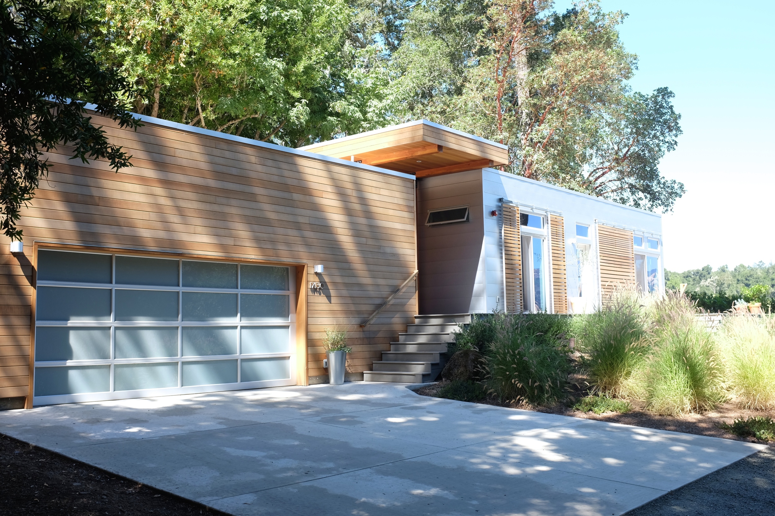
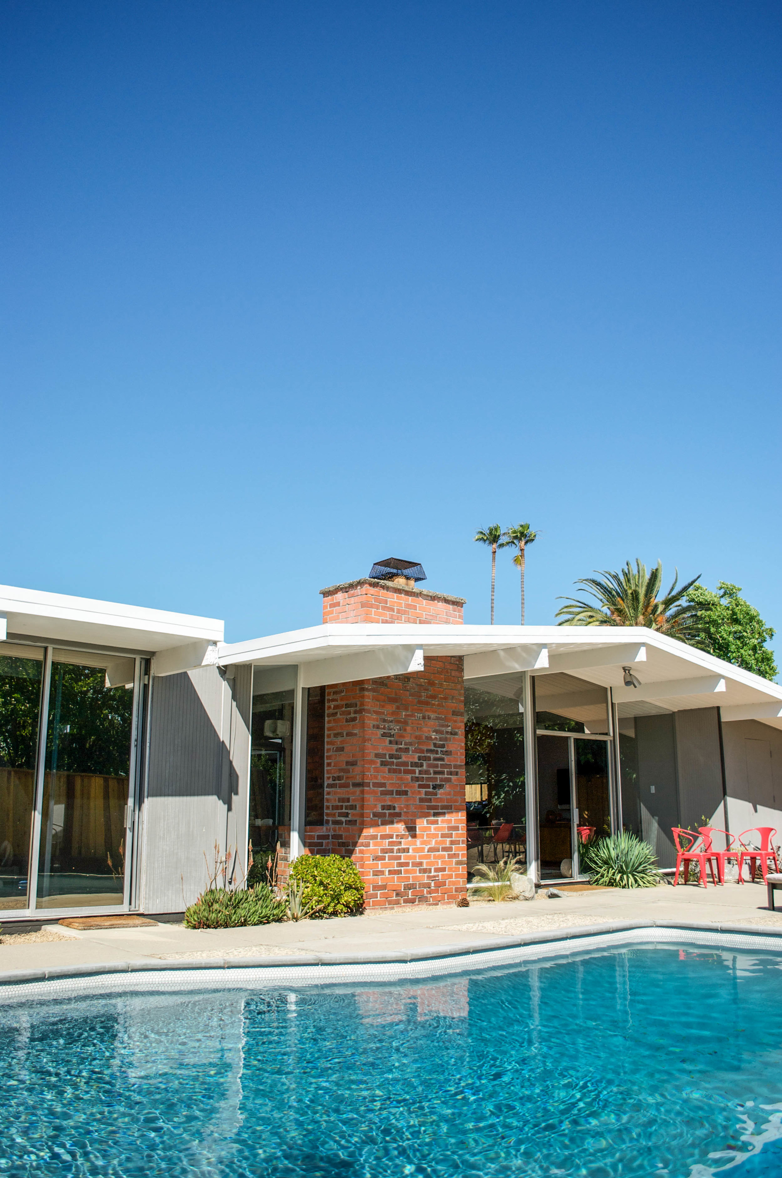
Kim's style is the perfect example of timeless minimal design.  Located in Sonoma County California, this modern home sits in the countryside on several acres. Kim and I began an online friendship a year ago, both sharing an adoration for art and interior design. Even though we have never met in person, I value her critiques and advice. Now let's dig into these stunning photos shall we!

The warm wood tones help this design blend in with its natural surroundings. They moved into this brand new house a year and a half ago. Kim is an artist and also works part-time, her husband Rob is an architect. You can check out her website at www…

The warm wood tones help this design blend in with its natural surroundings. They moved into this brand new house a year and a half ago. Kim is an artist and also works part-time, her husband Rob is an architect. You can check out her website at www.artstudiokm.com and her instagram at https://www.instagram.com/artstudiokm/

"Most people ask if he (Rob) designed our home but no.  It’s a lot more modern than both our styles.  It's our home for now but we hope one day we can design our own place.  I would say our top styles for our home would be more rustic modern inside and out. Most likely 2 level and just a bit cozy.  But you can’t have it all."

The structure on the left is the main living space. To the right Kim is lucky to have this gorgeous space to create in. I'm jealous of all that natural light!

The structure on the left is the main living space. To the right Kim is lucky to have this gorgeous space to create in. I'm jealous of all that natural light!

The outdoor dining area acts as an extension to the main living space.

The outdoor dining area acts as an extension to the main living space.

A great spot for entertaining and relaxing with friends and family.

A great spot for entertaining and relaxing with friends and family.

One of Kim's favourite things about her home are the sliding doors that are all along one side of the house. They open it up and enjoy a fresh breeze and amazing view.

One of Kim's favourite things about her home are the sliding doors that are all along one side of the house. They open it up and enjoy a fresh breeze and amazing view.

Lets step inside and see the interior shall we!

Lets step inside and see the interior shall we!

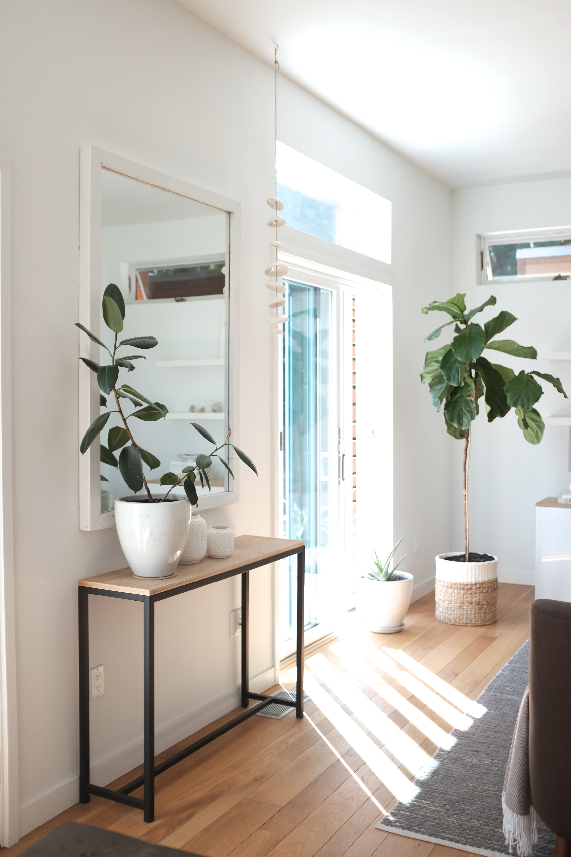
One of Kim's beautiful paintings is reflected in the mirror.

One of Kim's beautiful paintings is reflected in the mirror.

The space is filled with warmth and texture, the neutral colour scheme allows your eye to travel from one vignette to another seamlessly.

The space is filled with warmth and texture, the neutral colour scheme allows your eye to travel from one vignette to another seamlessly.

The simplicity of Kim's styling and the cacti print make this wall come to life.

The simplicity of Kim's styling and the cacti print make this wall come to life.

The addition of plants and flowers add so much to this minimal design.

The addition of plants and flowers add so much to this minimal design.

 The rooms are calming and uncluttered, she is curating every piece in her home with intent. Her husband and her have designed a clean-lined space that’s still infused with meaning and character. Kim tells me that her taste five years ago was the total opposite. She is quite content living with fewer material objects and has no problem waiting to find the right pieces to add in. 

"Growing up I loved to decorate my room and I would decorate with so much stuff. I have changed since then and now enjoy purchasing only things I really love and keeping my home as decluttered as possible."

"Growing up I loved to decorate my room and I would decorate with so much stuff. I have changed since then and now enjoy purchasing only things I really love and keeping my home as decluttered as possible."

Bringing natural elements into your home is an easy and inexpensive way to add texture.

Bringing natural elements into your home is an easy and inexpensive way to add texture.

The transition from one room to another is subtle. There are no bold or graphic elements from details such as wallpaper or ornate floor coverings. Allowing the floor plan to feel more open and inviting.

The family dog Ollie gets comfy on the slipcovered sofa.

The family dog Ollie gets comfy on the slipcovered sofa.

"I do have several items I would like to add to our home.  1. An overhead light for our dining table 2. We still need 2 more dining chairs 3. More light fixtures — love Schoolhouse fixtures 4. Cowhide rug for dining room.  It’s nice to know it doesn’t have to all get done at once though.  I like making a home come together over time.  It really makes it feel more special. Not like you just went to West Elm or Crate & Barrel and just bought it all." 

The kitchen is functional and stylish with a neutral palette.

The kitchen is functional and stylish with a neutral palette.

A single bloom adds the perfect pop of colour.

A single bloom adds the perfect pop of colour.

 "I enjoy many styles of decorating and right now my home is just more modern.  My main goal is to add a couple decor antique pieces + some items when we go to New Mexico in September.  I am really loving that ethnic feel.  I want to add a touch of both of these."

Layered textiles help add that coziness Kim loves.

Layered textiles help add that coziness Kim loves.

A peak into Kim's private work studio. Her inspiration wall is filled with inspirational photos and quotes.

A peak into Kim's private work studio. Her inspiration wall is filled with inspirational photos and quotes.

A relaxing spot to sit, enjoy a cup of tea and enjoy the sunshine.

A relaxing spot to sit, enjoy a cup of tea and enjoy the sunshine.

Just looking at her surroundings allows me to feel a tranquility and ease that is hard to describe.

Just looking at her surroundings allows me to feel a tranquility and ease that is hard to describe.

My taste is quite the opposite of Kim's. I love colour, pattern and lots of collectibles. When I opened up her email and saw the photos of her home I was blown away. I wish I could live in a home like this and surround myself in nature. I can't wait to one day come and visit in person.

Scandinavian House Feature

This is the lovely home of Line Fiil Anderson. I first discovered her through Instagram last year. She is an artist and her abstract paintings caught my eye right away. Not only does she work in a style that I enjoy, her pieces are often styled in her home which allowed me to see vignettes of her impeccable style. Located in Randers, Denmark; Line describes her home as a typical Danish home built in the 1970's. A unique thing about the structure is that it was used as an exhibition home for the first two years. Line and her boyfriend purchased it from the original homeowners in 2009. Since that time they have started a family here and come to love the space they call home. Her sons, Anton and Bertram, are similar ages to my two daughters, and keep her busy when she is not working or in her studio creating.

Before we go inside I want to share some photos of the gorgeous courtyard and terrace with you.

Before we go inside I want to share some photos of the gorgeous courtyard and terrace with you.

The layered textiles really make this outdoor space feel like an extension of the interior. I love the simplistic style often seen in Scandinavian design & Line has mastered it. This Hazel tree looks like a sculpture itself.

The layered textiles really make this outdoor space feel like an extension of the interior. I love the simplistic style often seen in Scandinavian design & Line has mastered it. This Hazel tree looks like a sculpture itself.

Line loves spending time here and having friends and neighbors over to sit and enjoy a glass of wine with. There is a river nearby that she often walks to, finding a lot of inspiration for her paintings from nature.

Line loves spending time here and having friends and neighbors over to sit and enjoy a glass of wine with. There is a river nearby that she often walks to, finding a lot of inspiration for her paintings from nature.

"We loved it from the time we stood in the hall – and it just felt like home, even before we saw the rest of the house." As a person who enjoys architecture and interior design I am usually drawn to a space for a specific reason. In this home it is …

"We loved it from the time we stood in the hall – and it just felt like home, even before we saw the rest of the house." As a person who enjoys architecture and interior design I am usually drawn to a space for a specific reason. In this home it is a combination of the furniture, art and accessories that speak to me. We have similar taste and love a great bargain!

"I love to be surrounded by things that not everyone has. I am drawn to the northern European style in combination with Bauhaus and Eastern/Middle East ethnic things and objects." So many pieces in the home have a story to go with them, my eye is co…

"I love to be surrounded by things that not everyone has. I am drawn to the northern European style in combination with Bauhaus and Eastern/Middle East ethnic things and objects." So many pieces in the home have a story to go with them, my eye is continuously travelling from one thing to another.

"The first furniture my grandmother bought (before she met my granddad) were designs from some of the greatest designers/architects in Denmark from the 1950´s. I have inherited some chairs and a cabinet from her. I love furniture (especially teak) f…

"The first furniture my grandmother bought (before she met my granddad) were designs from some of the greatest designers/architects in Denmark from the 1950´s. I have inherited some chairs and a cabinet from her. I love furniture (especially teak) from the 1950´s but also German Bauhaus interior." The eclectic collection of artwork throughout the home is amazing. I will never tire of a good gallery wall, we have several in our own house. The original stained glass is the perfect addition to this corner. Those colours make me smile.

A great spot to relax and enjoy a drink. I am so jealous of that chair!

A great spot to relax and enjoy a drink. I am so jealous of that chair!

When they moved into the house they decided to renovate the kitchen.  Line loves to cook and it was a small dark room that was not very inspiring. By tearing down the wall that divided the two rooms, they created a large open concept space full of natural light. Now they have this fantastic space for cooking, entertaining and allowing the boys to play.

No hardware has been added to the cabinetry, this helps to achieve a modern and timeless design. The addition of plants and warm wood tones help the space feel welcoming to friends and family.

No hardware has been added to the cabinetry, this helps to achieve a modern and timeless design. The addition of plants and warm wood tones help the space feel welcoming to friends and family.

One of Line's painting's adds a graphic element to this corner in the kitchen.

One of Line's painting's adds a graphic element to this corner in the kitchen.

A view of the dining area from the family room. The boys Wheely Bug is ready for a ride! How great are the 4 pieces of original art? Each member of the family created their own masterpiece with paint and a straw. Simple modern frames create a unique…

A view of the dining area from the family room. The boys Wheely Bug is ready for a ride! How great are the 4 pieces of original art? Each member of the family created their own masterpiece with paint and a straw. Simple modern frames create a unique collection.

A great piece of furniture can not only anchor the corner of a room, but also add as extra storage in a small space. Cupboards and drawers are great at hiding away kids toy's & books when not in use. I'm an expert a hiding clutter, the built-ins…

A great piece of furniture can not only anchor the corner of a room, but also add as extra storage in a small space. Cupboards and drawers are great at hiding away kids toy's & books when not in use. I'm an expert a hiding clutter, the built-ins in our living room are full of my daughters collections and craft supplies.

I love this corner and the simple white shelving that displays some of Line's favourite collectibles. I have always wanted a Danish mid century bird, these two caught my eye as soon as I saw the photo. Talk about a statement light fixture! You are n…

I love this corner and the simple white shelving that displays some of Line's favourite collectibles. I have always wanted a Danish mid century bird, these two caught my eye as soon as I saw the photo. Talk about a statement light fixture! You are not going to find that at a big box store folks. Gotta love a house with a stack of interior design magazines to browse, the European ones are always my favourite...even if I can't understand what they say.

"We are going to Berlin for a summer holiday and I hope to find some stuff at one of the wonderful flea markets in the city. I love going to flea markets here in Denmark, to buy unique objects for our house." This eclectic home is full of treasures, I don't think I can pick a favourite room it's all so good. I also love to thrift and find the treasure of the hunt so exciting. Once my husband & I travelled to Pittsburgh, instead of dreaming about seeing Falling Water the next day I was thinking about chairs I had seen earlier at the Salvation Army. I know right...my husband is a good man & we went back for them.

This is styled perfectly. You can't go wrong with black and white, and that pop of yellow! I have a thing for font. I'm one of those people.

This is styled perfectly. You can't go wrong with black and white, and that pop of yellow! I have a thing for font. I'm one of those people.

Line's grandfather was a cabinet maker and hand crafted this chair for his wife. After she passed, this family heirloom became a special addition to Line's home. Her colourful artwork makes this corner in the family room so welcoming.

Line's grandfather was a cabinet maker and hand crafted this chair for his wife. After she passed, this family heirloom became a special addition to Line's home. Her colourful artwork makes this corner in the family room so welcoming.

Line and one of her gorgeous paintings.

Line and one of her gorgeous paintings.

A peak inside her studio space. Lot's of room for storage and books.

A peak inside her studio space. Lot's of room for storage and books.

Bertram following in his mom's footprints.

Bertram following in his mom's footprints.

Stacks of original artwork and a collection of pottery...dreamy!

Stacks of original artwork and a collection of pottery...dreamy!

Line's home is the perfect mix of old and new, and has a cozy/casual vibe. Collectibles, artwork and furnishings are influenced by Scandinavian design and have me wanting to head to the closet flea market. Check out more of her incredible artwork at https://www.instagram.com/linefiil/

Mid Century House Feature- Laura Browning

I have a love for architecture, interior design and mid century homes. When I have free time away from my artwork, the kids and my new favourite show "Silicon Valley", you can find me online browsing homes of people who live in incredible spaces. Sometimes the eclectic decor choices or artwork get me excited. Or if I'm looking at an issue of Dwell magazine, then it's the clean contemporary lines & the structures themselves that I find the most appealing.

Today I'm so excited to share with you a wonderful space that my new friend Laura lives in with her husband, her adorable son and their family pets. I met Laura through social media and was captivated by every image I saw of her artwork & her home. I have a thing for vintage chairs and love to collect them. Laura paints the most gorgeous oil paintings of iconic designs and retro styles. You will see some of her original work throughout the tour, but she also does prints as well. Check her out at www.laurabrowningart.com

Laura and I chatted on FaceTime a few weeks ago, I loved hearing all the details about their Eichler neighborhood and asked her to share more about how they came about living here. This is what she had to say; 

Lincoln is ready to give us the tour, I told you he was the cutest!

Lincoln is ready to give us the tour, I told you he was the cutest!

Our California Modern home was built by Joseph Eichler in 1963. Eichler was one of the nation's most influential builders of modern homes during the mid 50’s through mid 60’s.  A typical Eichler features walls of glass, post-and-beam construction, and atriums at the center of the house. 

We initially discovered Eichler homes while driving around the Bay Area trying to decide where we wanted to move.  We were planning a big move from Southern California up to the Bay Area and had flexibility with where we settled.  I’ll never forget the first Eichler we toured: it was a similar model to ours, and as I walked through the front door I could see all the way through the house to the backyard…my jaw dropped.  My husband and I were hooked. 

My jaw is dropping as I look at this view!

My jaw is dropping as I look at this view!

The most major project we took on would have to be our floors.  When we moved in our floors were a mix of linoleum, carpet and VCT tiles.  After we had the old flooring removed I spent 30 straight days working myself to the bone grinding down the concrete and patching the holes left by the carpet tacks, cracks, etc.  I then applied a semi-transparent stain to mask the ghosted pattern left behind by the tiles.  5 years later and our floors still look lovely, are super durable and were well worth all the effort. 

We spent over a year actively trying to purchase an Eichler, it was a tough market with lots of competition.  Over time, it became too difficult to drop everything and travel to attend the open houses, so we would ask my parents who live about an hour away to check out any Eichler that came on the market.  This house that we bought was a foreclosure and we actually put an offer on it and got into a little bidding war without even seeing it first.  At the time, it felt crazy and so risky but it has worked out so well for us. 

This photo is taken in the backyard looking into the dining area and atrium.

This photo is taken in the backyard looking into the dining area and atrium.

Another shot from the backyard. Those windows are what every house needs!

Another shot from the backyard. Those windows are what every house needs!

The mix of organic materials used complement the sleek mid century style of the home. The original ceiling details are stunning!

The mix of organic materials used complement the sleek mid century style of the home. The original ceiling details are stunning!

Another project I tackled was refinishing the mahogany walls in the living room portion of our house.  Ours were in pretty bad shape, likely not cared for much since the house was built. I see many Eichler homeowners that opt to replace their wood walls so I knew that would be an option, but first, I wanted to see if I could refinish ours and save the time and cost of replacing the wood.  I sanded the old finish off the walls, did some patch work and then coated the wood with some Danish Oil and finished it with wax.  Now they’re soft to the touch, and totally gorgeous. 

The decor in our home is all very significant to us.  We travel a lot (by exchanging our home with other awesome modern homes around the world) and wherever we go I love to pick up pieces that will end up in our house.  Most of the pieces don’t necessarily look like they’re from someplace exotic… a white vase or a simple gray bowl that looks like it could be from anywhere… but I have this very specific memory of where we were when I bought it (and sometimes the crazy effort that went into getting it home!) and that brings us both great joy in our every day lives.  When we need something and haven’t already found it during our travels, I always head to Etsy to find something that has been thoughtfully crafted (and so we can support other artists). 

I would love to visit Laura one day, I can imagine us now sipping cocktails in the atrium while we discuss art and design.

I would love to visit Laura one day, I can imagine us now sipping cocktails in the atrium while we discuss art and design.

The perfect spot for an afternoon nap.

The perfect spot for an afternoon nap.

Lincoln's playroom is furnished with a modern table and chair set, as well as a spot to camp out and get cozy.

Lincoln's playroom is furnished with a modern table and chair set, as well as a spot to camp out and get cozy.

I think any guest would be happy waking up to this natural light.

I think any guest would be happy waking up to this natural light.

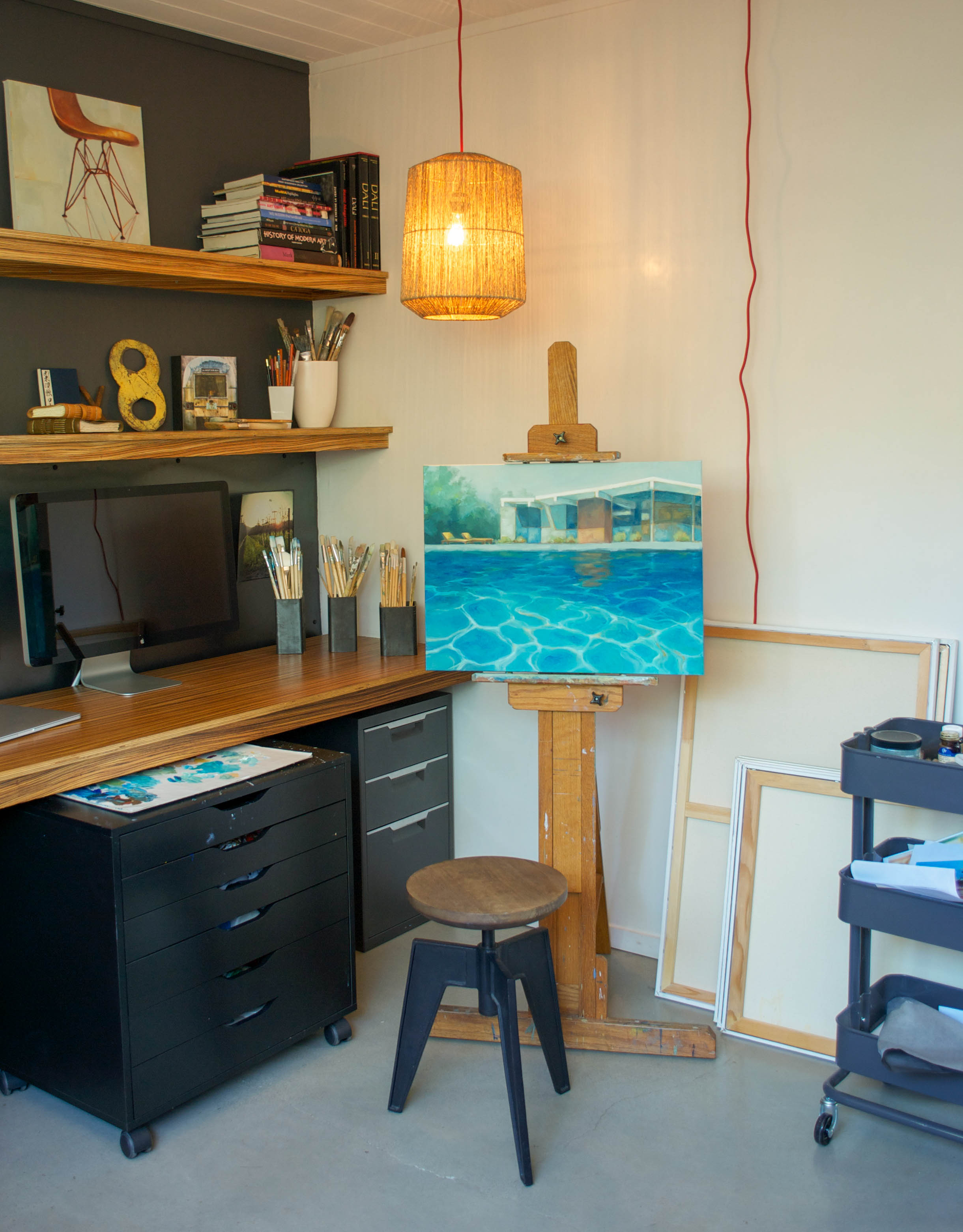
The office and studio space where Laura paints showcases some of her oil paintings and collectibles. "My work is inspired by the classic California dream and timelessness of modern design from the mid 20th century. I focus on luminous color interact…

The office and studio space where Laura paints showcases some of her oil paintings and collectibles. "My work is inspired by the classic California dream and timelessness of modern design from the mid 20th century. I focus on luminous color interactions, and iconic shapes that give glimpses of the idyllic California lifestyle."

I mentioned to Laura that I know we would hit it off in person as we have the same art books filling our shelves. I adore the pendant that hangs above her easel & this painting truly captures the California lifestyle that Laura is inspired by.

I mentioned to Laura that I know we would hit it off in person as we have the same art books filling our shelves. I adore the pendant that hangs above her easel & this painting truly captures the California lifestyle that Laura is inspired by.

We have a talented friend & neighbor (redneckmodern.com) who I worked with on a number of projects around our house including new interior wood doors and hardware, new front door. Most impressively the amazing zebra-wood built in desk for my office/studio. 

Her paintings express a combination of texture, light & shadow so well, it's hard to choose a favourite.

Her paintings express a combination of texture, light & shadow so well, it's hard to choose a favourite.

The master bedroom with a clear view to the pool. Laura worked so hard to refinish the floors, I'm glad they have not been covered by area rugs.

The master bedroom with a clear view to the pool. Laura worked so hard to refinish the floors, I'm glad they have not been covered by area rugs.

One of Laura's paintings adds a splash of colour to the neautral palette.

One of Laura's paintings adds a splash of colour to the neautral palette.

A painting by Philip Barlow is a focal point above this vintage dresser that belonged to Laura's parents.

A painting by Philip Barlow is a focal point above this vintage dresser that belonged to Laura's parents.

There was a lot of work to get the house in fully functional condition, so we spent the first few years taking care of all the major issues that surfaced (plumbing leaks, electrical problems, new foam roof, pool leaks, broken pool equipment, etc).  In the past few years, we have finally been able to focus on areas of renovation that we can actually see and appreciate.  There is still a lot of work we have planned (kitchen!) but are able to really enjoy our house as it is now.  

Lincoln's bedroom is a great example of a timeless design that will grow with him. The colourful modern rug softens the space and creates an area for play.

Lincoln's bedroom is a great example of a timeless design that will grow with him. The colourful modern rug softens the space and creates an area for play.

The Pantone book of Colors is wonderful, it makes a great gift. Parents will love it as much as the kids. Who needs a rocking horse when you have an Eames Elephant!

The Pantone book of Colors is wonderful, it makes a great gift. Parents will love it as much as the kids. Who needs a rocking horse when you have an Eames Elephant!

A great chair to curl up and read a bedtime story.

A great chair to curl up and read a bedtime story.

Is it crazy that I'm jealous of a toddler's bedroom. The Eames Hang-It-All hooks are the perfect pop of color on this dark grey wall.

Is it crazy that I'm jealous of a toddler's bedroom. The Eames Hang-It-All hooks are the perfect pop of color on this dark grey wall.

There are 70 other Eichler homes in our neighborhood, and two other Eichler neighborhoods in our city.  The best part of living in an Eichler was a huge surprise to us, but I’ve since heard it’s pretty common in other Eichler hood’s as well.  There is an enormous sense of community here, people that have been brought together by their shared passion for their homes and mid-century design.  Most of our neighbors I consider good friends and spend time with on a regular basis.  One family hosts an open dinner on the first Sunday of every month, other groups get together regularly to hike or craft, or get like aged kids together for play groups. Just last weekend we had a huge block party, and we have yearly celebrations on major holidays like 4th of July, Thanksgiving, and Christmas.  

The atrium in the evening really puts this glass home center stage.

The atrium in the evening really puts this glass home center stage.

Laura and her husband have done so much work on their home, now they can enjoy this space with family and friends.

I look forward to seeing what direction they choose to go with when they design the kitchen. My husband and I have vacationed in San Francisco, looking forward to our next trip so we can see this beautiful family home in person.

Uniquely Women Post

After our home was featured on Apartment Therapy a few months ago, Nicole asked me if I would be interested in doing a post for her blog Uniquely Women. If you want to know my secrets on: finding great vintage pieces, keeping all our girls stuff tidy & organized, as well as adding original artwork into your space. Then read my interview!

http://uniquelywomen.net/mid-century-vintage-home-tour/

These cupboards are hiding books, toys, games & camera equipment. Thank you to the previous home owners for ditching the fireplace and replacing it with built-ins!

These cupboards are hiding books, toys, games & camera equipment. Thank you to the previous home owners for ditching the fireplace and replacing it with built-ins!

Mid Century House Feature

If you read my previous post on Pittsburgh then you know that I have an interest in architecture. One of my favourite styles is mid-century design. I've worked in several furniture stores that sold classic styles such as Eames & Bertoia. If I was to choose my dream home, it would not be a mansion with a triple car garage. My taste leads me to a horizontal home with angular features such as a slanted roof and a car port. Think "Brady Bunch" exterior with a "Mad Men" interior.

Social Media has allowed me to start online friendships with people who live all over the world. On Instagram for example, I often check to see who likes or comments on my artwork. Perhaps they have similar interests and tastes?  A few weeks ago I came across Audrey, a free lance writer living in Seattle. After browsing through her photos, I was drawn to her design choices and her stunning home.  I'm not a shy person and if I lived near her I would invite myself to see it in person...it's that good! I asked her if she would be willing to share some photos on my blog and she was up for it.

As I look outside & see snow falling onto the ground, I will just close my eyes and picture myself in her dreamy yard.

As I look outside & see snow falling onto the ground, I will just close my eyes and picture myself in her dreamy yard.

Audrey and her husband are DIY professionals in my opinion. They have already tackled the exterior, modernizing it with black paint and building the most amazing upper/lower decks and fences. They are currently finishing renovations on the kitchen, bathrooms, bedrooms and backyard. Busy I know...and she is also home schooling their two sons. I asked her to share a bit about the house and this is what she had to say:

This looks like it's out of an issue of Dwell magazine! Her husband has incredible carpentry skills.

This looks like it's out of an issue of Dwell magazine! Her husband has incredible carpentry skills.

Those angles get me excited!

Those angles get me excited!

"We moved into our home two years ago. We had been searching for our home for almost a full year after looking, while we were renting. We really wanted a mid century modern home, specifically a Burrows home. He was a well known contractor in the 1950's who had moved to Seattle from California. He had absorbed the styles of Eichler, Neutra, and Alexander and wanted to build homes like that in the Northwest. After searching the slim active listings, we found our dream home built in 1958 by John Burrows."

The details such as the wood ceiling & brick work surrounding the fireplace are original.

The details such as the wood ceiling & brick work surrounding the fireplace are original.

For $20 Audrey purchased this 4x8 piece of Douglas Fir from a local Lumbar Yard & created this simple mantle.

For $20 Audrey purchased this 4x8 piece of Douglas Fir from a local Lumbar Yard & created this simple mantle.

"The home owners were retiring and wanting to move out of state. I immediately contacted them by email and waited on pins and needles until I heard from them the next day! Our style is eclectic. I tends towards mid century and Scandinavian modern, with a dash of bohemian thrown in."

This corner is full of texture. Her Fiddle- leaf fig is thriving in this natural light...I'm jealous! 

This corner is full of texture. Her Fiddle- leaf fig is thriving in this natural light...I'm jealous! 

I can't pick my favourite element in this room, the puppy...the light fixtures...the wall of windows...or the view into the yard? It's all so good!!!

I can't pick my favourite element in this room, the puppy...the light fixtures...the wall of windows...or the view into the yard? It's all so good!!!

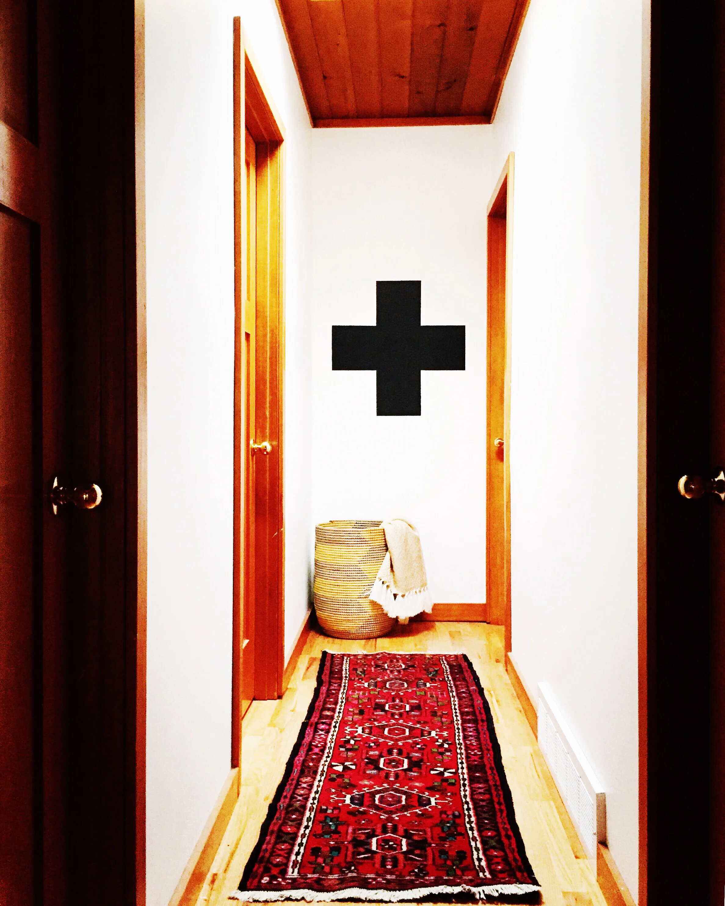
This hallway leads you to the bedrooms. Audrey recently painted this cross on the wall & wasn't sure if her husband would like it. He came home from work & helped her measure to make sure it was perfect. True DIY love people! 

This hallway leads you to the bedrooms. Audrey recently painted this cross on the wall & wasn't sure if her husband would like it. He came home from work & helped her measure to make sure it was perfect. True DIY love people! 

This area of the kitchen has already been renovated. Don't we all wish we could look out those stunning windows while we did the dishes.

This area of the kitchen has already been renovated. Don't we all wish we could look out those stunning windows while we did the dishes.

Open shelving & a black and white colour scheme add to the modern kitchen.

Open shelving & a black and white colour scheme add to the modern kitchen.

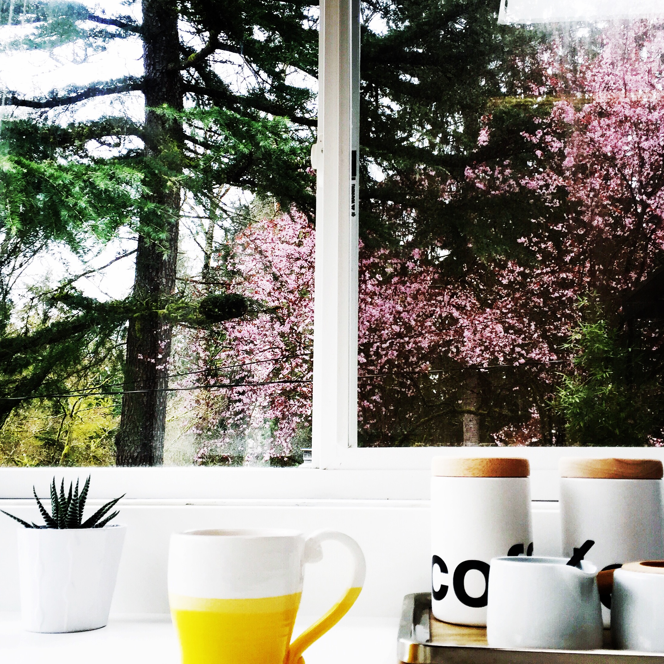
I had to include this photo as the view out that window is breath-taking. 

I had to include this photo as the view out that window is breath-taking. 

I hope that Audrey will share more of her home with us in 6 months or so, to see what projects have been crossed off the list. I'm excited to see what those bathrooms are going to look like as we also want to re-do ours.  I haven't been to Seattle, but if I go please note I will be stopping by for a tea.

Apartment Therapy House Tour

Two years ago I received Lisa Congdon's book "Art Inc." for my birthday. Last year I began to re-read it as I started the process of making my website. One of her suggestions was to write down your goals & hang them as a daily reminder. I hung my list on the bulletin board in my art studio & as 2016 approached I was happy with my accomplishments so far.

This list has helped me grow as an artist & achieve personal fulfillment as well. If you have read any of my previous posts or follow me on instagram you already know that I love design, mid century style & home decor magazines. One of my goals was just crossed off the list & I'm happy to share it with you! I have been reading Apartment Therapy and browsing the house tours they post for a long time...I don't even know how many years. I sent a few photos in before Christmas & waited to hear back. A photographer contacted us & arrived a few weeks later to shoot our home. I'm a typical Virgo & love a deadline. I knew all of the little things I kept putting off were going to have to happen before the day arrived. Our Thrift Shop dining chairs got new black seats however, they all didn't get painted as it was freezing cold outside & I am not crazy! The Swissted posters that had been taped to the wall at our front door finally got the piece of acrylic mounted on top of them. Lastly my youngest daughter Kinley got her big girl room. When we moved in two years ago I painted it white & she got things passed down from her older sister. I finally chose a paint colour with her, painted the walls & ceiling, got her headboard recovered in a neutral fabric & had a seat made for her rattan chair. She would always say her chair was so comfy before as she sat on her stuffed animals, I think it's a bit nicer on her bottom now.

Our living room. Photo by Lauren Kolyn

Our living room. Photo by Lauren Kolyn

I look forward to sharing more personal experiences with you on the blog every week. Today I hope that some of you thought to yourself, "hey, my house could be featured too". If you are passionate about something what are you waiting for? Make it happen!

Check out the tour at Apartment Therapy here

Roslyn Costanzo of Style Forage

You know that friend you have that you never get to see, the one who connects with you instantly after months of separation? Roslyn is that girlfriend, a kind hearted & creative individual who I know many of you will relate to. We've been friends for 17 yrs, & now find ourselves in different cities with families of our own.

I met Roz in University & we hit it off immediately. Her love of fashion has always been evident, even in the art studio. I would wear my Grandpa's old cardigan & jeans, Roz would casually enter the room in a leopard blouse & knee boots. Her style has evolved, & I am so happy that she is sharing a bit of herself today. Her design at home mixes both modern & mid century, and her love of art is noticeable in every vignette. When I need an update on what the current trends are, I check out her website & know that with little effort I can make myself appear like I am a mom who's got it figured out. Roslyn often shops at Joe Fresh, & if you are Canadian you know that means you can do the groceries & pick up something for yourself at the same time...it's a win win!

At home this colourful painting made by Roslyn's husband Mike, hangs proudly in the dining room.

At home this colourful painting made by Roslyn's husband Mike, hangs proudly in the dining room.

Q. What is your creative background?

I've always loved art and aesthetics in general--including fashion. I majored in visual arts in undergrad where I focused on small-scale sculpture, then I did my MA in art history. Currently I'm a freelance writer, specializing in fashion and lifestyle topics, and I have a personal style blog, www.styleforage.com.

Q. Do you have a favourite piece of art in your home?

My husband is (used to be?), a painter. I guess it's better to say that he is a painter that used to have a huge studio in Hamilton where he painted large-scale pieces. One of my favourites now hangs in our dining room but hung behind the crib in the our son's nursery when all we had was a tiny "solarium" to work with in our old apartment. It's big--4' x 6'--and it was perfect because it had a huge visual impact in a room where we otherwise had very little space to work with. Plus I thought it was cool that Viggo could wake up looking at his dad's art everyday. Now it hangs in our dining room and I still love it--partly because of the sentimentality and also because it is just a really beautiful painting.

Q. Where do you feel most inspired?

I get a lot of inspiration just walking around Toronto. I love living in a place where aesthetics play a major role in everyday life, whether it be the architecture, restaurants or the street style. I find myself taking mental notes of outfits and decor ideas all the time.  

Our dining room. I got the Knoll table as commission years ago when I worked at a mid-century Modern furniture store. The vintage credenza was a gift to ourselves after our wedding, and the chairs were a clearance find at IKEA, which satisfied my de…

Our dining room. I got the Knoll table as commission years ago when I worked at a mid-century Modern furniture store. The vintage credenza was a gift to ourselves after our wedding, and the chairs were a clearance find at IKEA, which satisfied my desire for chairs with caning. We assembled the gallery wall from pieces that we love by our artist friends and some are by Mike, while others belonged to my grandparents. The mirror is an antique we picked up here in Toronto one day.

Q. How would you describe your personal style at home?

Well my home is eclectic and filled with art. My husband and I belong to an artist-run-centre in Niagara, Niagara Artists Centre, and have purchased work by several of the member artists. As far as furniture is concerned, I'm typically attracted to minimal lines and bold colours but more recently, when I was redecorating the master bedroom in our small Toronto apartment to accommodate ourselves plus the baby, I found myself drawn to crisp whites. My aim was to make the space (which I knew I'd be spending more time in once the babe arrived), feel like a peaceful retreat amidst the chaos that our cramped (toy-filled) apartment, can quickly become.

Our refreshed bedroom where I incorporated a lot of white for a peaceful, de-cluttered feel. 

Our refreshed bedroom where I incorporated a lot of white for a peaceful, de-cluttered feel. 

I love this corner of our home right now because of all the love that went into making the pieces we used to decorate it. The quilt was a gift when Gigi was born and is based on an abstract work by our friend and artist, Marco Cibola. My sister cross-stitched Gigi's name, and I ordered the sweet, little weaving from Canadian Etsy seller, WIOUX.

Our DIY floating bookshelf.

Other favourite pieces by Marco Cibola

Other favourite pieces by Marco Cibola

Q. What was one of the biggest challenges that you faced as you started your own business? How did you overcome that?

I always say that I'm a writer for a reason--I like to be behind the scenes--but working as a freelancer in a fairly saturated market requires a lot of hustle and networking so I'm constantly pushing myself beyond my comfort zone in that regard, which has probably been the toughest part. (I know it sounds crazy because I have a blog and am active on social media but those are just pictures--I prefer to let them do the talking!) I think I am overcoming it naturally though, just by the fact that I am becoming more comfortable with what I'm doing. For a while I didn't think of my work as a business, but rather odd jobs that I was stringing together. Now I'm proud that I have made a career for myself that allows me to do what I love while staying at home with my four year old and five month old.

shoes-sketch.jpg

Q. What are you working on now that you¹re most excited about?

I'm working on some holiday stories, which I always love because I really do think it's the most wonderful time of the year :). I've also got some exciting collaborations coming up on the blog. I should mention that what really excites me in terms of style, is finding great deals. I'm a shopaholic on a shoestring and I love the challenge that that presents. The collaboration that I'm most excited about is in keeping with the idea that you can look stylish no matter your clothing budget!

I want to thank Roslyn for taking the time out of her busy schedule to do this post today. Take a minute & check out her website, her approach to style is affordable & classic.

http://www.styleforage.com