House Feature - Adrian Briones

If you've been reading the blog for a while then you already know that I love architecture & design. If I could choose anywhere around the globe to travel to, Australia would be high on my list. I came across today's space when the homeowner discovered me on Instagram. I always check out my new followers & see if I think we have similar taste. Adrian's style is a combination of classic & modern. He agreed to share his home with us all & I'm so excited for you to check it out. 

 "I started building a portfolio of properties when I was in my early twenties and started to ramp up this activity as I began my career in advertising. For close to a decade I was the head of digital operations at a large Publisher and although I enjoyed what I did, I became more passionate about all things property. Spending most weekends renovating, styling, visiting furniture and reno supply showrooms along with inspecting and buying properties." 

 "I had decided to quit my job so I could focus on what truly resonates to who I am. I realized that I was never going to achieve my goals by staying in the same place doing the same thing. I took a risk by going out on my own and haven't looked back since. To date, I've undertaken six property projects with interior design being my favourite aspect."

"I had already visualized white roses lining the front fence, so planting these were first of the landscaping priorities."

"I had already visualized white roses lining the front fence, so planting these were first of the landscaping priorities."

"As soon as I saw an ad for the stark white weatherboard house, I knew it would be my forever home. With its high ceilings, original period features, reno potential and its white picket fence with carved rose indentations. It had so much character."

I love this house number, it's got a vintage quality that stands out against the white siding.

I love this house number, it's got a vintage quality that stands out against the white siding.

"I'm a fan of Kinfolk Home, so my renos and interior styling follows the philosophy of creating a habitat that is purposeful, calm, not overly trendy. Choosing pieces that are well crafted and timeless with some creative clutter dotted around the home."

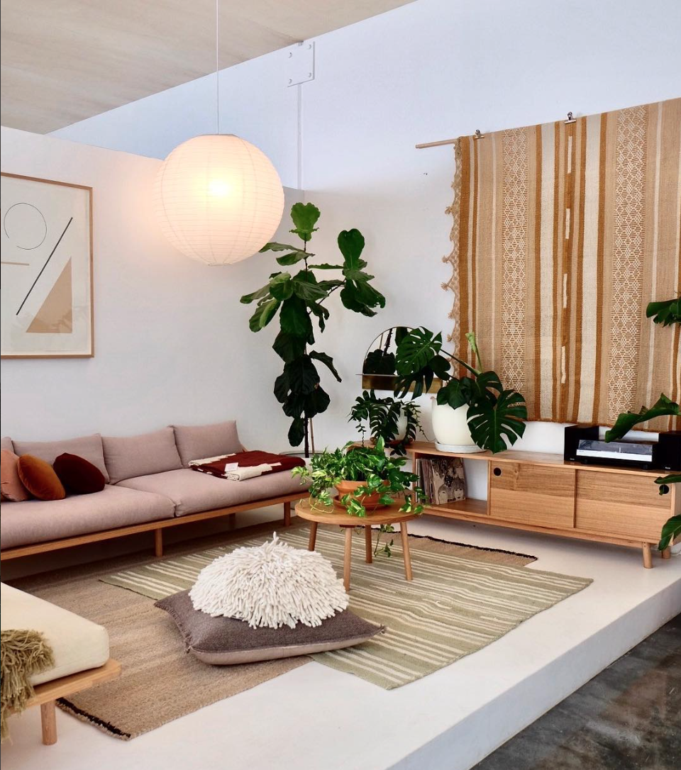
"I love to entertain, so I didn't want a room that looked great but was filled with uncomfortable furniture. I must have sat on hundreds of sofas before deciding on a very comfortable 3.5 seater filled with duck feathers; handcrafted in Australia." Textured Poufs add additional seating around the oversized coffee table. The room is intimate, and feels like a log cabin especially when the fireplace is on."

How comfy does that black mid century chair look! I collect chairs (bad habit) you don't need a matching pair if you find that perfect one.

How comfy does that black mid century chair look! I collect chairs (bad habit) you don't need a matching pair if you find that perfect one.

"When it came to designing my latest project, I wanted to respect the era in which it was built being circa 1950." Adrian describes his style as vintage luxe.

The greenery adds a pop of colour in many of the rooms in this home. Plants really are an inexpensive element that adds a lot of character.

The greenery adds a pop of colour in many of the rooms in this home. Plants really are an inexpensive element that adds a lot of character.

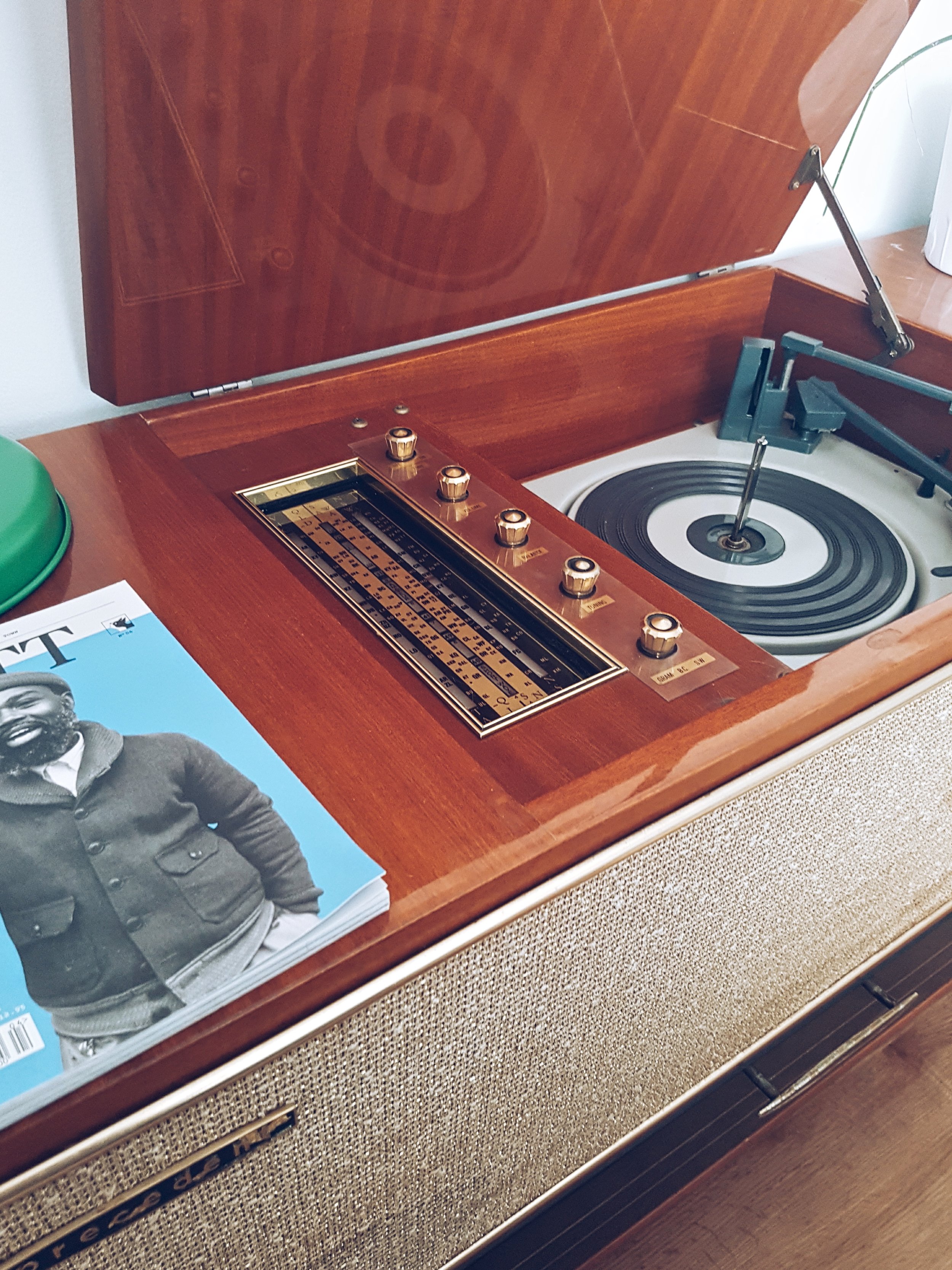
One of Adrian's favourite elements in the living room is his vintage record player from the 1960's.

One of Adrian's favourite elements in the living room is his vintage record player from the 1960's.

A framed Encaustic by Carly Lecerf sits on the mantle. "This room is intimate and feels like a log cabin especially when the fireplace is on."

A framed Encaustic by Carly Lecerf sits on the mantle. "This room is intimate and feels like a log cabin especially when the fireplace is on."

"Before starting any design project, I would always ask myself "Will I need to update the look in five years?" This will then set the tone and budget. I rarely give into current trends to ensure the look doesn't become outdated or impersonal."

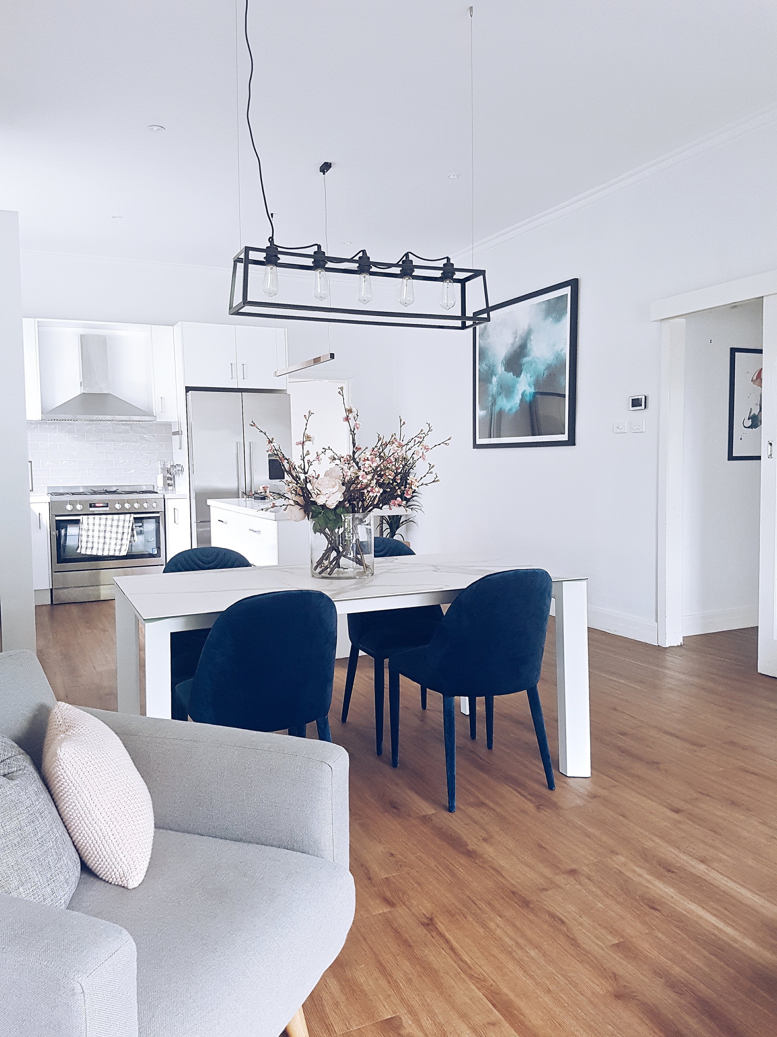
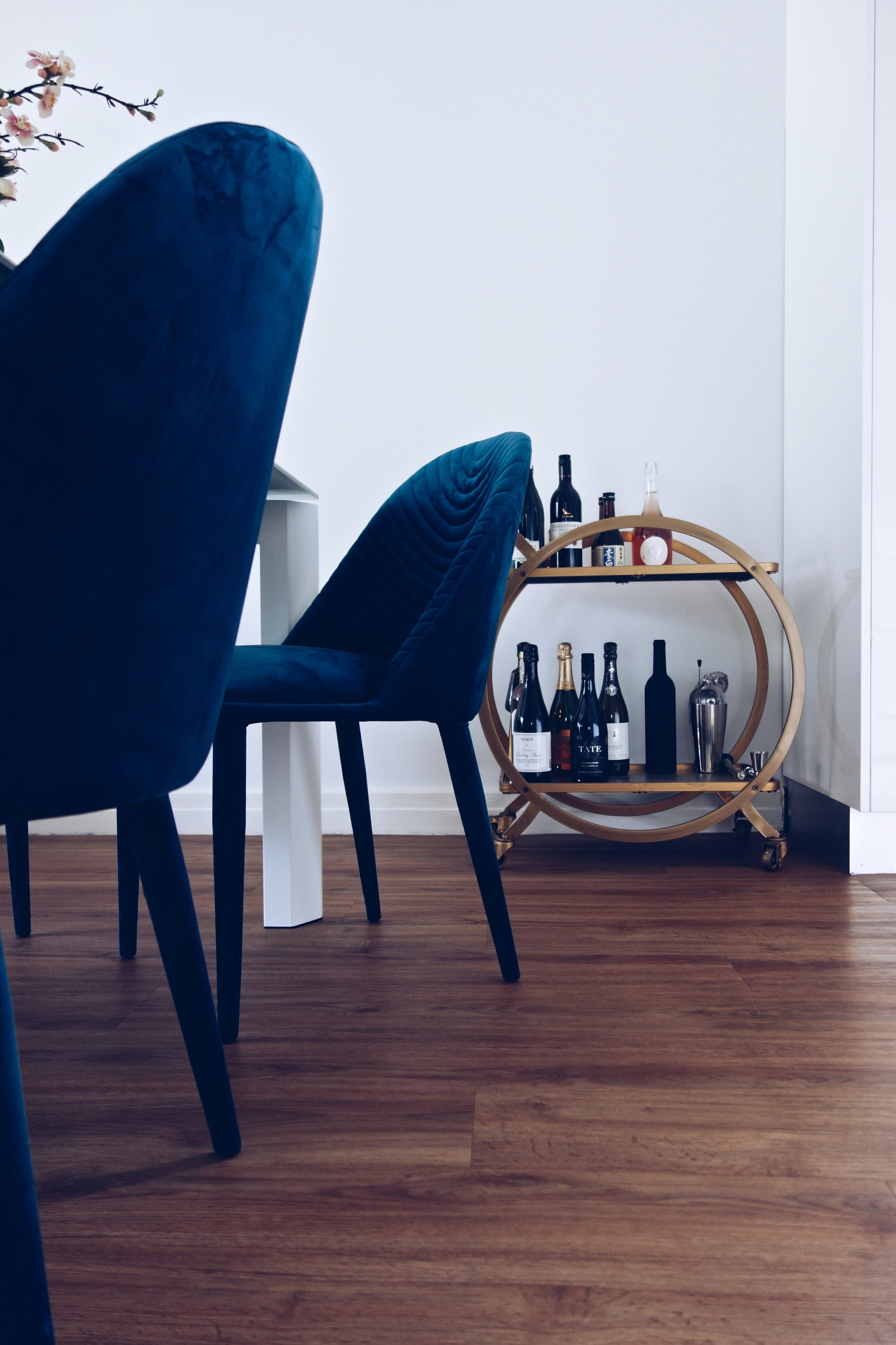
The dining area is the most formal part of the home. The addition of velvet dining chairs and a stone dining table with a marbled effect help define the open concept space. A vintage bar cart is often relied upon during house parties. 

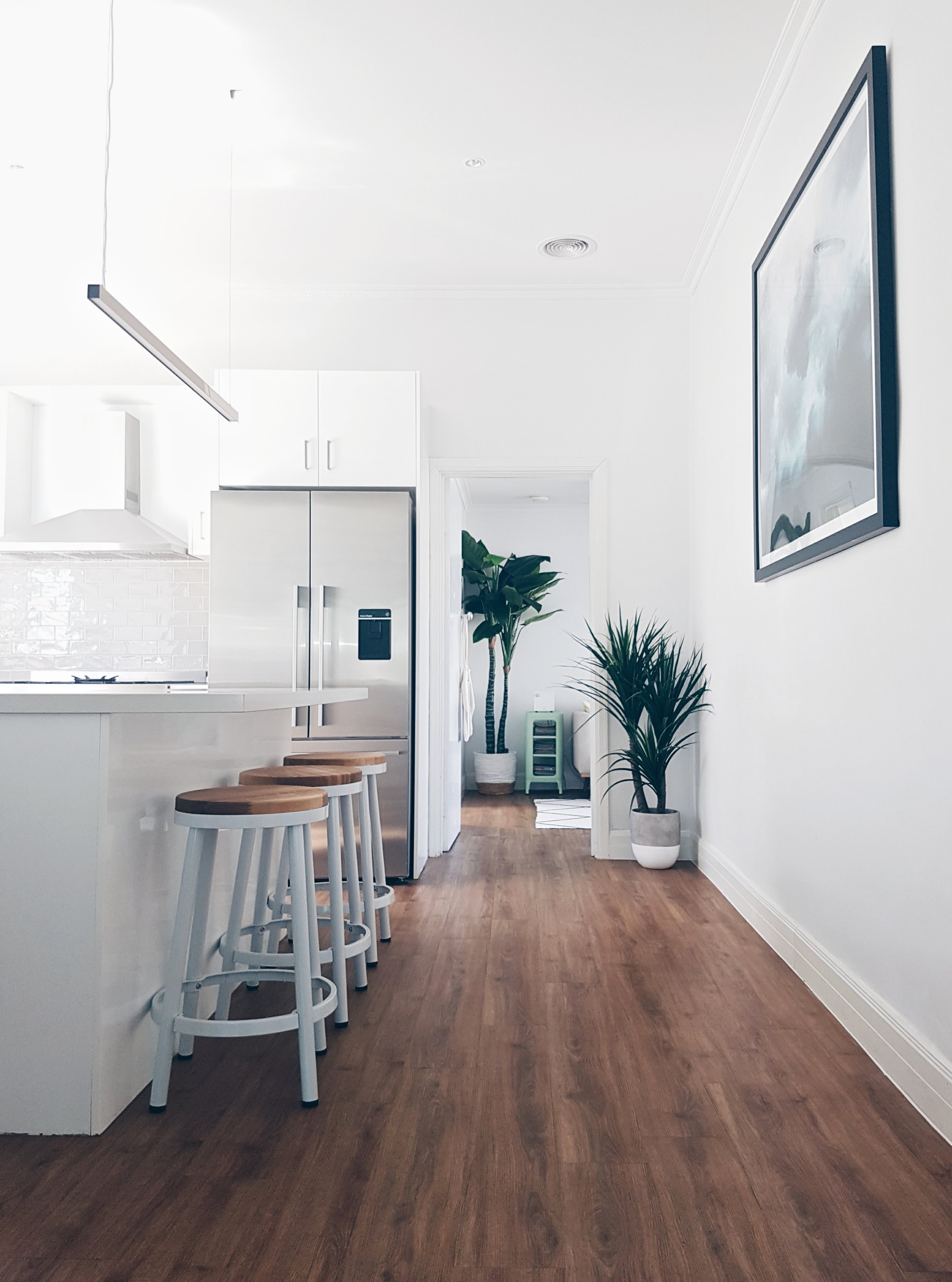
The modern kitchen provides a great spot for Adrian to entertain & cook for his friends. I really like the subway tile backsplash he has chosen. It's neutral & creates texture when the light hits it. You can't go wrong with white cabinetry.

The modern kitchen provides a great spot for Adrian to entertain & cook for his friends. I really like the subway tile backsplash he has chosen. It's neutral & creates texture when the light hits it. You can't go wrong with white cabinetry.

"I love cooking, so a 900 mm stove was essential."

"I love cooking, so a 900 mm stove was essential."

"Over the last few years, I've also been helping other writers publish their books - after releasing my cookbook 'What the heck is Filipino Food' a few years ago which won a Gourmand World Cookbook Award  - through workshops at The Melbourne Writer's Festival, Writers Victoria as well as facilitating my own classes that has grown into a full time business." Adrian is one busy guy!

Those dining chairs look so comfy. My eyes are instantly drawn to the subtle pattern on the back. It's details like these that make the space unique.

Those dining chairs look so comfy. My eyes are instantly drawn to the subtle pattern on the back. It's details like these that make the space unique.

Copper strip lighting gives that luxe feel above the island. An oversized painting of an ocean storm adds a bit of colour and ties together the navy chairs from the dining area.

Even the fence is great. Wood mixed with metal, very simple & modern.

Even the fence is great. Wood mixed with metal, very simple & modern.

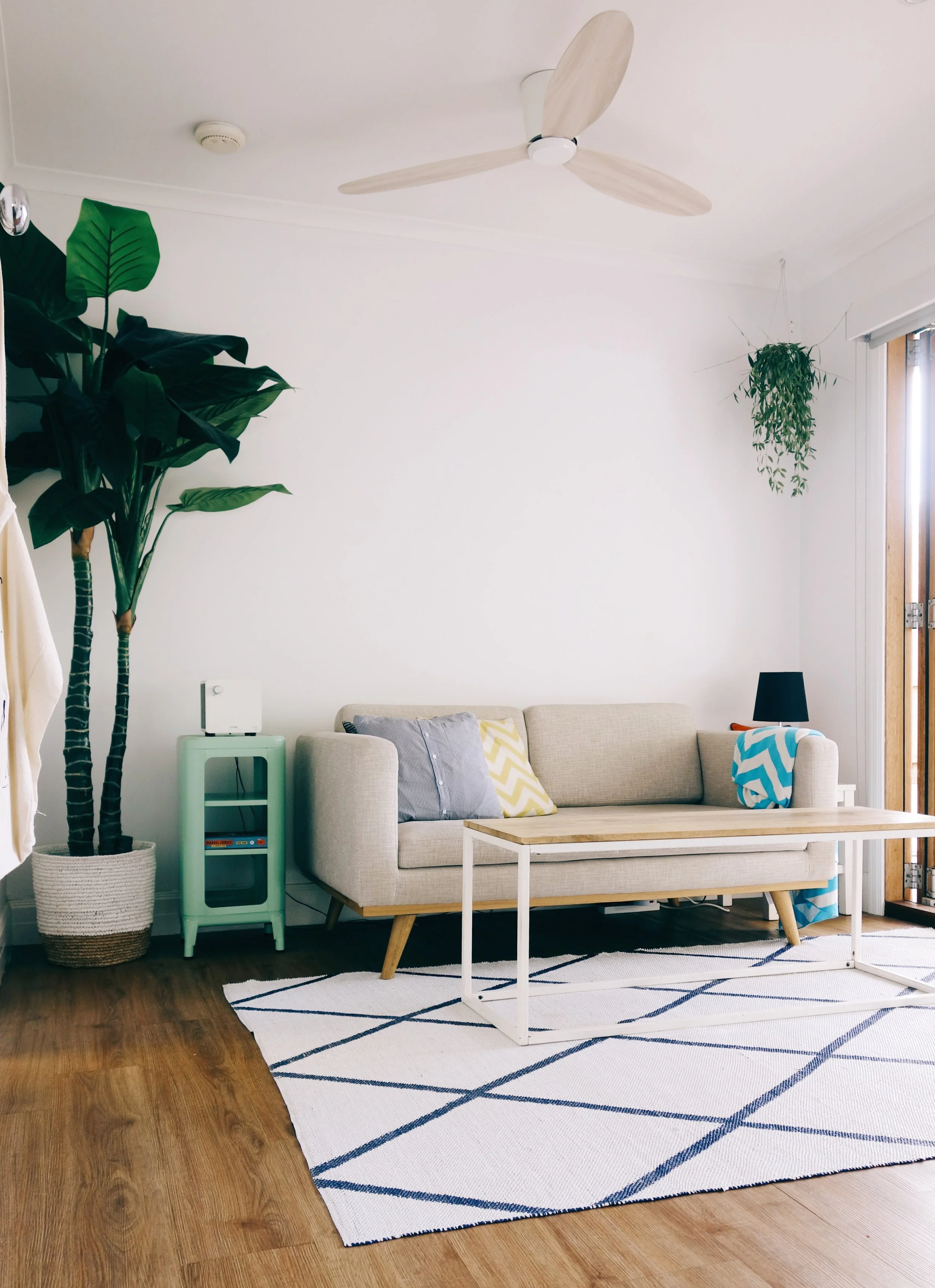
"Previously a bedroom/study, I wanted the space to be multifunctional but styled to have a seamless indoor to outdoor ascetic similar to an indoor courtyard considering it opens up into the deck. I put in a larger than life indoor plant, hanging plants and a ceiling fan in ash wood as well as a coastal themed rug to compliment the summer vibe."

I'm so jealous of the bi fold doors, they really do blend the two spaces together. You can watch the television from either area....movie night!

I'm so jealous of the bi fold doors, they really do blend the two spaces together. You can watch the television from either area....movie night!

"During the warmer months, I'm usually found lazing about on one of the sofas on the deck, soaking up the sun with the pets." 

There is a large grass front yard for Cookie to run around in and a rear deck and garden for Creamy the cat to explore. The blue patio chairs add a retro feel to the space.

"The main bedroom has sliding mirrored BIR's made of brass with the ceiling still retaining the original 1900's ornamental plaster works."

"I replaced the pendant light with a brass art deco pendant that took months to track down, creating a sense of nostalgia."

"I replaced the pendant light with a brass art deco pendant that took months to track down, creating a sense of nostalgia."

One of Adrian's favourite pieces of art hangs in the hallway. A framed print that reminds him of his cat, by artist Lora Zombie.

"Every room serves a purpose. For instance, rather than having a guest bedroom that would only collect dust, I converted that into a Walk in Robe with a library nook. I can find sanctuary here with my comics, vinyl records and the growing number of unfinished books."

Creamy is chillin'

Creamy is chillin'

"I chose to pair the existing BIR with shelving and a console table in rosewood and oak clothing racks for my favourite shirts, suits and jackets. This reno was special because it was my place of residence, so I splurged (just a little!)."

Adrian if I ever do make it to Melbourne you know I'm coming over to sit on the patio & enjoy a cocktail.


Lindsey Hampton

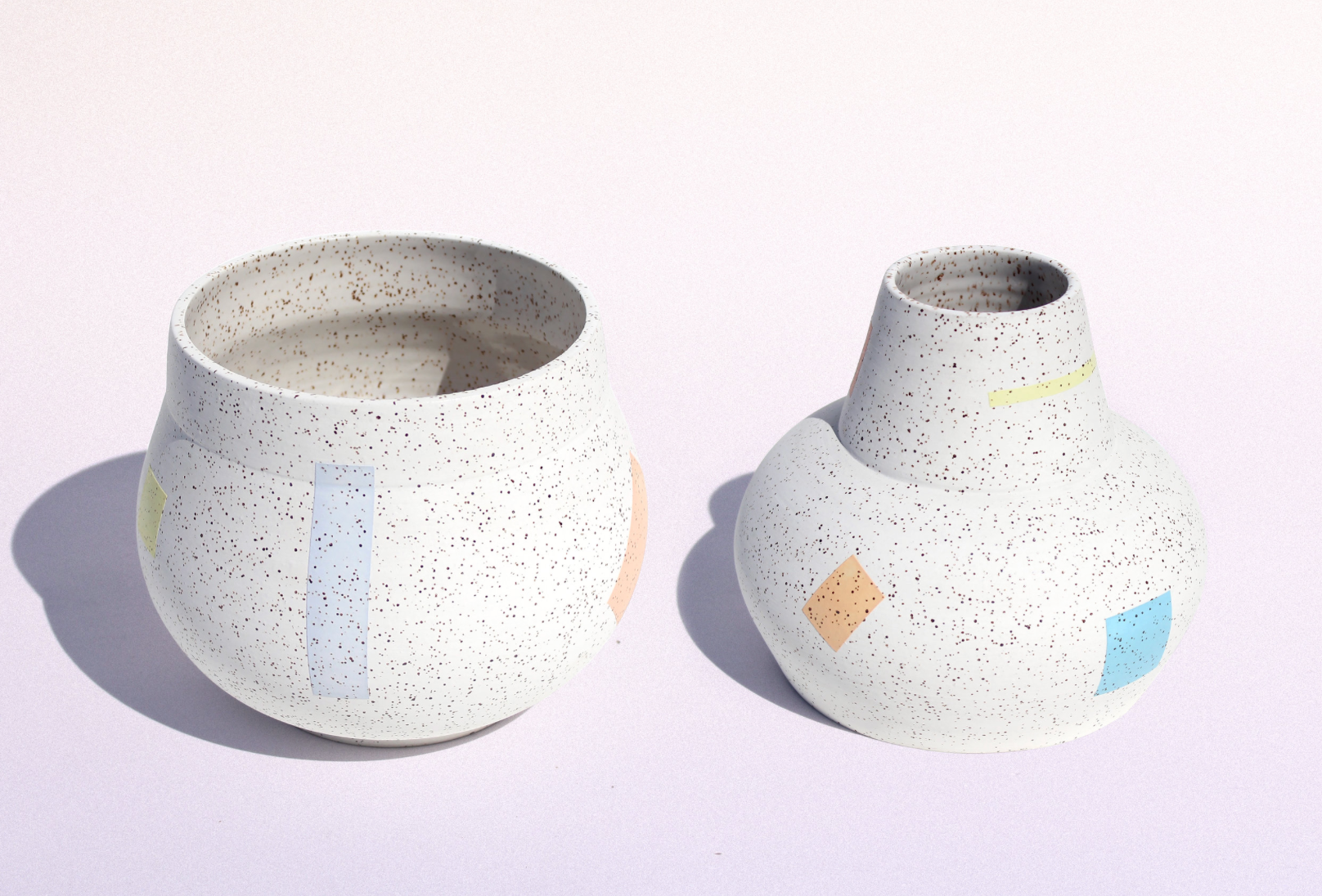
I recently discovered the work of Vancouver based artist Lindsey Hampton while flipping through domino magazine's current issue. A vase of hers caught my eye & I made a note to check out her website. I loved everything I saw & decided that I would share her work. She is a graphic designer as well as a ceramicist, and has been creating for years. “I got into ceramics to fulfill a need to create in multiple dimensions.” 

I always find inspiration from design magazines.

I always find inspiration from design magazines.

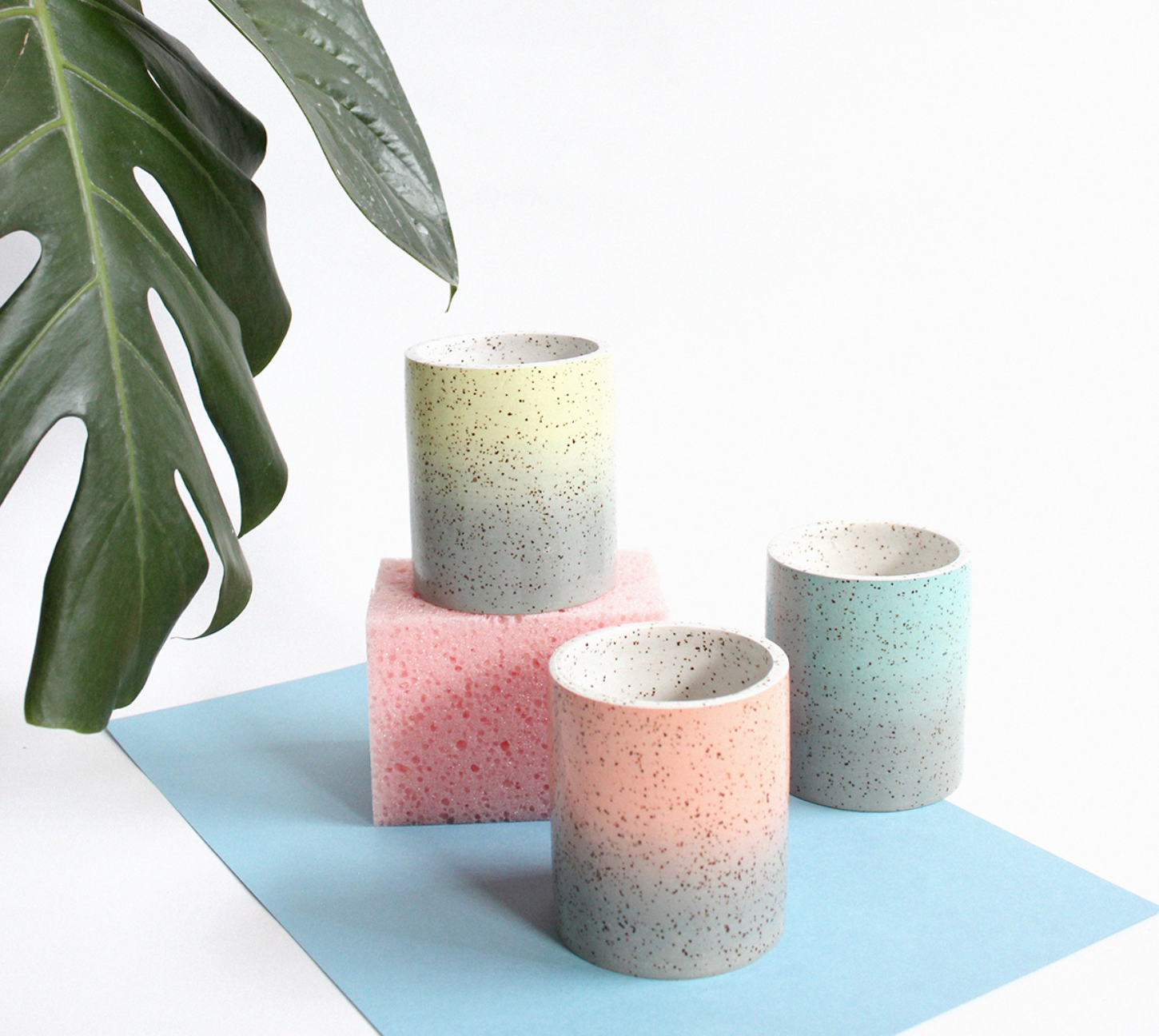
Her speckled stoneware has the most beautiful colour combinations. High gloss glazes mixed with modern shapes have me dreaming of owning some of her pieces for myself. I've never attempted any kind of pottery, maybe this summer I should sign up for a class & challenge myself. 

I read an interview Lindsey did a few years ago & wanted to share a quote of hers with all the makers reading this post. "The best thing I ever did was stop caring. I don’t mean that in an apathetic way but that I learned to not be too precious about anything. Things break and get messed up or just fail and all I can do is try to figure out why and troubleshoot. It’s easy to get stressed out when other people’s deadlines are involved but I just try to remind myself that I’m a one woman operation that does handmade ceramics and if anyone gets too mad they probably shouldn’t be buying into such a delicate, patient process. I also take great pleasure in purposely smashing things that didn’t turn out the way I wanted so it’s kind of a win-win."

A corner of Lindsey's workspace.

A corner of Lindsey's workspace.

Lindsey makes a lot of custom orders for clients as well as boutiques around the globe. I recognized her work immediately when I saw it at Coming Soon, a shop I wrote about a few months ago. The use of pastel hues in her work has me inspired to head to my easel & paint.

Highlights of the week

I recently decided that I wanted to change up the art in our home. We have a large collection that is spread out on a few gallery walls. I won a contest my friend Meg from September Wren was having through Instagram & our new prints just arrived this week. She is a talented photographer living in Santa Cruz, her work is amazing go check her out. She let me choose which pieces I wanted, how lucky am I! It was really difficult to narrow down, she has a great eye for mid century design and vintage signs (two of my favourite things). It's been 3 years since we moved in & I did the majority of our decorating. This week the gallery wall in our living room got a refresh. I thought it was time to change things up as my daughters' now have an Aquarium that sits in front of the wall of art. I'll share photos soon, pinky swear.

This is the largest print I received from Meg. I popped it in the frame as soon as I opened it up.

This is the largest print I received from Meg. I popped it in the frame as soon as I opened it up.

It feels like so long ago that I visited the Albright-Knox Gallery in Buffalo. We recently went to Niagara Falls with our daughters & I pointed out all of the places that I used to live while attending University. We would go on field trips to the gallery with my art class for the day since the border was so close by. I checked out the website recently & Shantell Martin currently has an exhibit on that ends in a few weeks. She has an installation inside the gallery "Someday We Can" as well as a public mural shown below. "This is the first time an artist working with the Albright-Knox's Public Art Initiative has installed work simultaneously at the museum and in the community."

Shantell Martin working on her mural, Dance Everyday, 2017, at 537 East Delavan Avenue. Photograph by Connie Tsang.

Shantell Martin working on her mural, Dance Everyday, 2017, at 537 East Delavan Avenue. Photograph by Connie Tsang.

Pampa is a homewares brand based in Byron Bay, Australia. I recently came across them on Instagram & loved every image I saw. "Our team works directly with skilled artisans in remote and rural Argentina to bring you the finest-quality woven textiles."

These planters are show stoppers, I may have to paint a few!

These planters are show stoppers, I may have to paint a few!

A glimpse of their showroom. I love the vibe in here!

A glimpse of their showroom. I love the vibe in here!

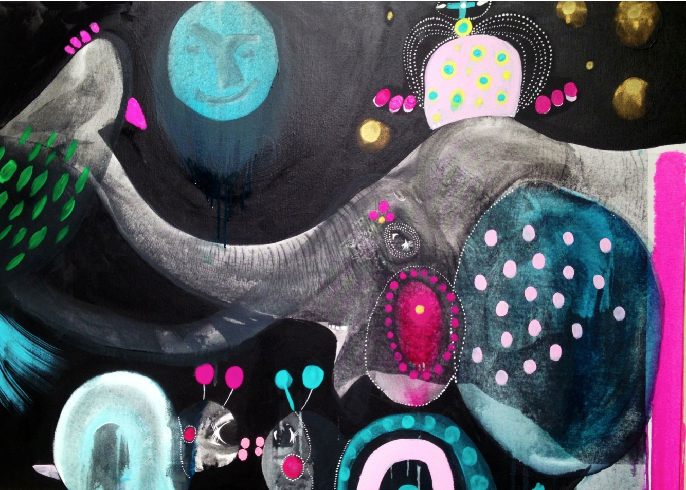
It's hard for me to believe that is has already been one year since I had my first solo exhibit. Lots has happened since then & I'm so thankful that I had that gallery space to show my work within the community. It was definitely a learning experience in the studio, as I attempted to make a cohesive body of work. I have become quite fond of using my putty knife & continue to use it to paint my Plant Study paintings.

I recently mentioned on social media that my favourite colour is Turquoise, can you tell I dig shades of blue?

I recently mentioned on social media that my favourite colour is Turquoise, can you tell I dig shades of blue?

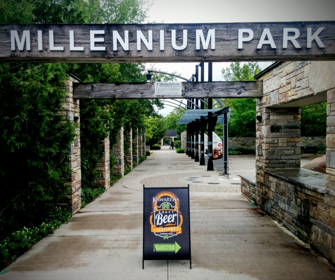
Last Friday night my husband & I attended our annual Beer Festival in town. We sampled delicious food & drinks while listening to some great live music. The highlight from the night didn't actually happen until Monday when my husband won a radio contest he entered at the Festival. I love me some Fleetwood Mac so I was really excited when he heard that he won tickets to see members from the band tour with their new album, Lindsey Buckingham/Christine McVie. We head to Toronto in a few weeks, hopefully they play a few oldies so I can sing along. 

Have a good weekend folks & Happy Father's Day to all the daddy's out there.

Wallpapers I'm crushing on

I've had a few people ask me if I was going to continue painting Plant Study paintings since my latest collection was just released. The answer is "YES" I love creating them & I've been saving images of wallpapers to incorporate into the backgrounds for months. My last collection had a lot of Kelly Wearstler pattern's infused in them, I changed up some of the colour combo's but the lines were very much her designs.

I thought I would do a post about a few companies that have caught my eye, if you are in the market for wallpaper check them out. First up is Flat Vernacular. "Specializing in original fabrics and “wallpaper with a life of its own” (The New York Times), founders Payton Cosell Turner and Brian Kaspr create patterns from a variety of elements as playful and captivating as they are distinct. Designed and screen printed locally in the US."

The Heavens - Zephyr. This pattern comes in a variety of colours, I am digging the hot pink.

The Heavens - Zephyr. This pattern comes in a variety of colours, I am digging the hot pink.

Folded - Cyan. This pattern reminds me of my friend Angela's artwork.

Folded - Cyan. This pattern reminds me of my friend Angela's artwork.

Levante - Breccia. The texture is so good in this! It would be tricky to paint, but I may give it a try.

Levante - Breccia. The texture is so good in this! It would be tricky to paint, but I may give it a try.

"Drop It MODERN is an interiors company committed to creating modern prints and textures for the home. Drop it Modern serves to bridge the gap between traditional home décor and modern printmaking with artfully curated design in the form of drapes, wallpapers, wedding blankets and more. Based in Tillamook, Oregon, all designs are created in house and manufactured in their local Oregon community."      

Playground Mural -  Floridian. The designer Bree has a thing for clean lines & mid century furniture...we would get along just fine.

Playground Mural -  Floridian. The designer Bree has a thing for clean lines & mid century furniture...we would get along just fine.

Grid - Miami Blue This pattern comes in a variety of colours & has an 80's vibe I adore.

Grid - Miami Blue This pattern comes in a variety of colours & has an 80's vibe I adore.

Wanderlust Mural -  Rust

Wanderlust Mural -  Rust

"Juju is a wallpaper studio located in beautiful Portland, Oregon. Every roll is printed by hand, is untrimmed, and in most cases has been made to order. We print with water based inks on creamy, durable, sustainably harvested paper. Primarily inspired by folk art of all kinds, our designs suggest the simplicity of an elegant old-fashioned signature, or the impossibly perfect collection of driftwood and sea glass on the shore."

 Big Moon - Gold on Navy I painted this pattern a few months ago, it was hard on my eyes for sure. I loved it but then I screwed up the plant. It's now waiting to be painted over, do it for the process right!

 Big Moon - Gold on Navy I painted this pattern a few months ago, it was hard on my eyes for sure. I loved it but then I screwed up the plant. It's now waiting to be painted over, do it for the process right!

The Pearl - Gunmetal on Blush

The Pearl - Gunmetal on Blush

"Astek Inc. is a leader in both the wallcovering and custom digital printing industries. Astek works with clients worldwide to meet their design, digital printing, wallcovering and signage needs. Our clientele spans a variety of industries including hospitality, architecture, interior design, fashion retail, motion picture and television."

Encrusted - Spectrum

Encrusted - Spectrum

I saw this bedroom on Design Sponge & immediately knew I had to find out who made this stunning wallcovering. I don't think I would attempt to paint something similar for my Plant Studies, but I love it so much I had to include it. That texture is what I dream about!

Art & Illustration

A few weeks ago I took my daughters to the library. They often choose authors they know, usually ones that have funny stories & lots of pictures. I browsed the shelves & was taken by the beautiful cover I had in my hand. The title of the book is Tokyo Digs a Garden I didn't have time to read the back & see what the story was about, I just thought it had the most gorgeous illustrations. 

All of these colours & designs just make me happy!

All of these colours & designs just make me happy!

"Tokyo lives in a small house between giant buildings with his family and his cat, Kevin. For years, highways and skyscrapers have been built up around the family’s house where once there were hills and trees. Will they ever experience the natural world again? One day, an old woman offers Tokyo seeds, telling him they will grow into whatever he wishes. Tokyo and his grandfather are astonished when the seeds grow into a forest so lush that it takes over the entire city overnight. Soon the whole city has gone wild, with animals roaming where cars once drove. But is this a problem to be surmounted, or a new way of living to be embraced?"

Not only did they like it, they requested  this book almost every night before bed. I did a bit of research on the Canadian author as I was curious if he had other books I could get. Turns out that the illustrator is his brother-in-law & this is the authors first book. Jon-Erik Lappano: "The idea for the book actually came to me over a decade ago. I was working as a landscaper in Toronto, and there was a designer at the company who was very influenced by Japanese gardening. So as someone gardening in the tiny backyards of Toronto, transforming concrete squares into complete ecosystems, I started daydreaming about a child who plants seeds that overtake a city." 

Winner of the 2016 Governor General's Literary Award for Young People's Literature — Illustrated Books.

Winner of the 2016 Governor General's Literary Award for Young People's Literature — Illustrated Books.

He wrote the story & used his kids to test out what parts seemed to intrigue or bore them. My girls are 5 & 7, I personally think this book would be good for children who are younger as well. I often try to choose a book instead of a toy, when my daughter's attend a Birthday party. If you love to give the gift of reading I suggest you look this one up. 

I recently discovered Melbourne based artist Jessie Breakwell. "Her work is offbeat, quirky and full of wonder. Jessie’s vibrant paintings evoke a sense of enchantment and fun providing light relief and a satisfying diversion from inescapable reality."  She began this journey 6 years ago & now runs her own gallery.

"Amazonia" 

"Amazonia" 

She offers original paintings as well as prints & does a lot of commissions of dog portraits. I think I love her Jungle Series the most. I can't get enough of these Zebras! 

"Grimes"

"Grimes"

"Midnight In Bombay"

"Midnight In Bombay"

"In A Sea Of Navy"

"In A Sea Of Navy"

A few more weeks until school is out & summer holidays are in full effect. I'm going to try my best to stay organized & paint while my daughters are home with me. There will be many trips to our local library & lots of new books to get excited about. Last summer I got a lot accomplished in my little home studio, cross your fingers this year is the same.

Studio Scenes

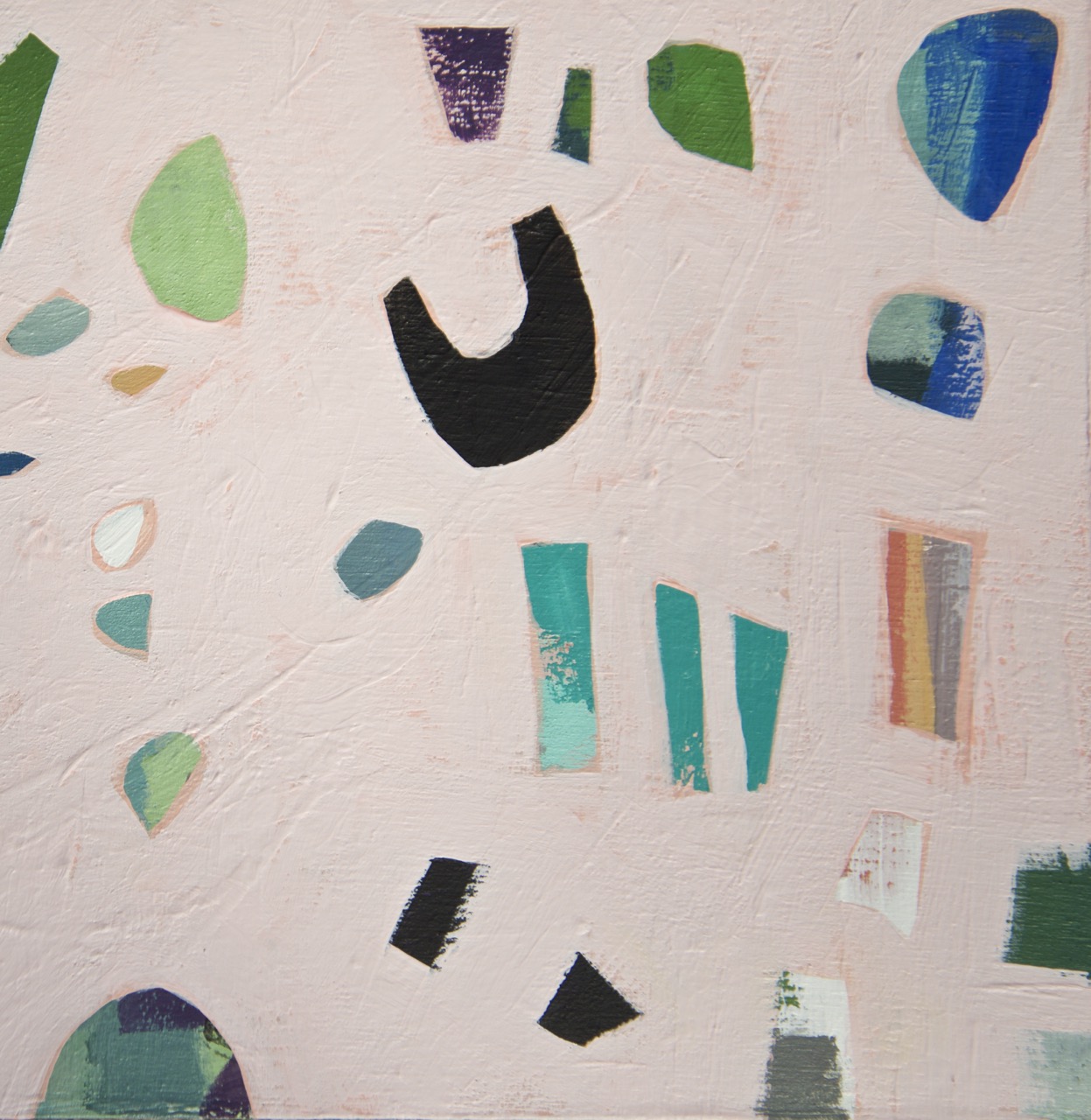
I'm currently working on a new body of work that is inspired by natural elements, many found near water or on the beach. With a focus on shapes and forms, textural paintings are happening and I'm really excited about the direction I'm headed. My colour palette is filled with all of my favourites; turquoise, pink and aqua. 

Photo by Álvaro Peñalta

Photo by Álvaro Peñalta

My husband I and travelled to California for our 10 year wedding anniversary. We stopped at Moonstone Beach and were taken by the beauty of the surroundings.

D600_DSC_1917.jpg
The pattern on these rocks is amazing! You can find similar shapes in my paintings.

The pattern on these rocks is amazing! You can find similar shapes in my paintings.

Detail.

Detail.

D600_DSC_1928.jpg
Each rock is unique & the colours & textures are so mesmerizing. We brought a small bag home for our daughters.

Each rock is unique & the colours & textures are so mesmerizing. We brought a small bag home for our daughters.

Detail.

Detail.
My husband captured me in my best wannabe model pose. I wish our trip lasted longer & that we could go back again this summer. A girl can dream right?

My husband captured me in my best wannabe model pose. I wish our trip lasted longer & that we could go back again this summer. A girl can dream right?

Make sure you sign up for my newsletter if you would like to see the collection & have the chance to reserve a piece before it's released June 8th.


Weekend Getaway

A few months ago my sister-in-law asked if she could take our daughters camping for a weekend this summer. My husband & I decided that we would try & go somewhere for a little relaxation for a few days & not join them. It just so happens to be our Anniversary as well, a little romance...yes please!

I came across this photo online & the mid-century cottage vibe had me dreaming of a place this fun. Photo by Eric Striffler

I came across this photo online & the mid-century cottage vibe had me dreaming of a place this fun. Photo by Eric Striffler

My first thought was staying at a Bed & Breakfast we visited a few years ago in Bloomfield ON. It turns out the owners recently became parents & are taking a break from hosting. A few days passed & then I was flipping through an issue of House & Home Magazine. I saw another option in the same area. The feature was on Kate Golding

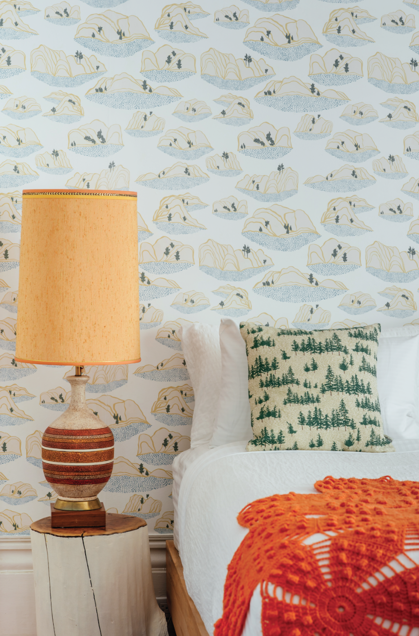
Here is Kate's Sand Dunes wallpaper pattern. The Chuckery Hill pattern is shown on the toss cushion. Photo by Johnny C Y Lam.

Here is Kate's Sand Dunes wallpaper pattern. The Chuckery Hill pattern is shown on the toss cushion. Photo by Johnny C Y Lam.

The Inn had recently done a makeover on a few of the rooms and it looks great. I called to see if they had availability & to my surprise they were booked until October! I then proceeded to check every hotel & airbnb in the area with no luck. This place is wine country so all the city folks come here to chill & drink on the weekends. I told my husband I would check some places in Montreal, a short train ride away. We went there on our Honeymoon & haven't been back in 14 yrs. Turns out that it's the same weekend as the jazz festival & a comedy festival. Therefore, no rooms or places to rent. My next thought was Toronto, my husband commutes there a few days a week so really not much of a holiday. 
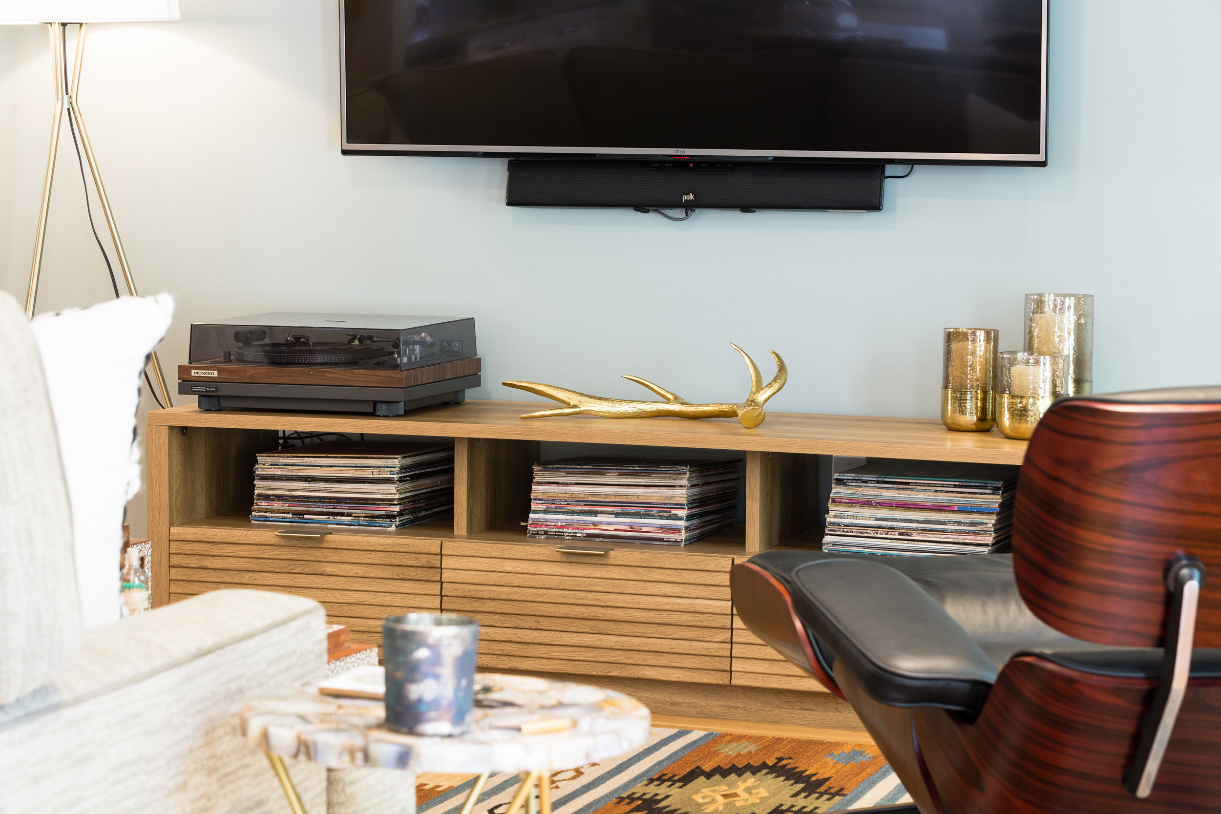
Photo by Nikolas Koenig

Photo by Nikolas Koenig

Still imagining us enjoying lunch at The Drake as we had a few summers ago, I didn't think Prince Edward County was going to happen. But then the stars aligned & magic happened! I met a friend for brunch & she mentioned that she had booked a room in a new place that is just opening up. The motel was just remodelled & has all the mid-century goodness I love, & wasn't going to break the bank. I checked their website & it turns out they were having a grand opening party/open house the same day I booked our room. If I had waited a few days, our dates would have probably been taken as there is only a few suites available.

So this place used to be decorated in a Fisherman theme, it's all girly now! The new owners are re-inventing the motel experience & the place has a boutique feel. Eight weeks until I'm sipping cocktails at the bar. I need to add that those barstools are stunning! A little Palm Springs in Canada, I'll take it.

Artspace 50/50 Art Draw

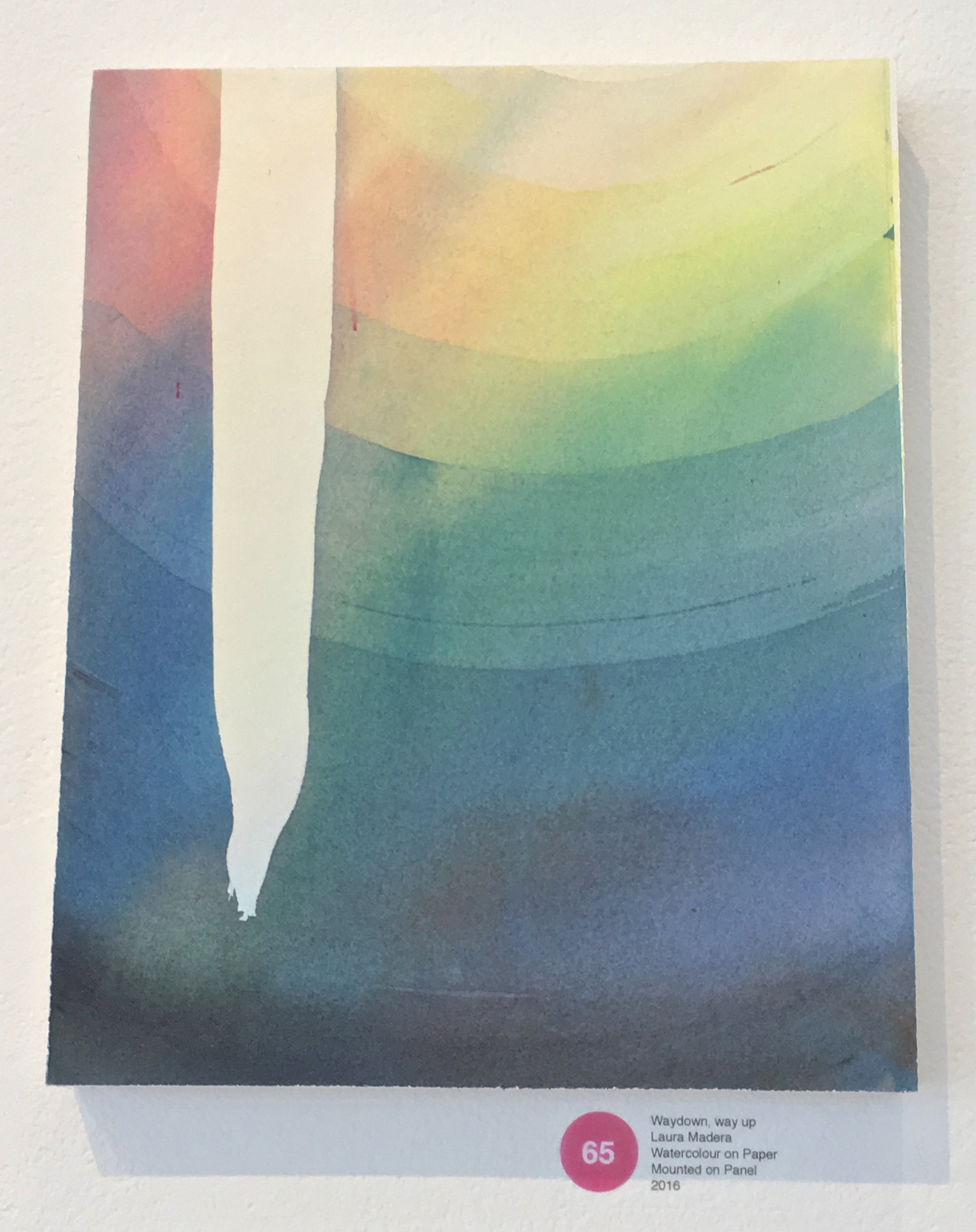
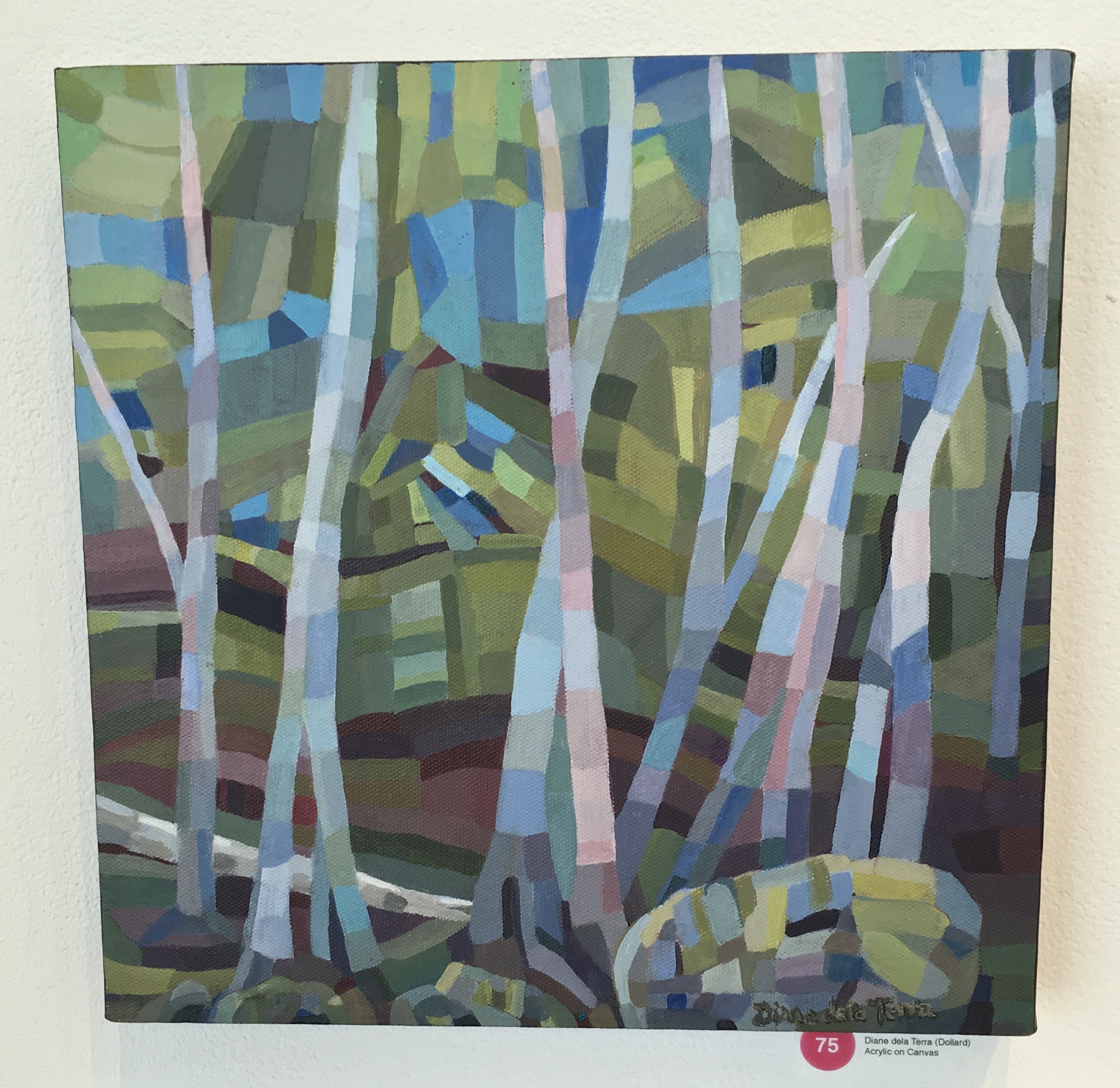
Saturday night was wonderful, not only did I have a date with my husband that started at the movie theatre at 4:00 (Guardians Of The Galaxy, his choice!) We also got to enjoy an evening of art. Proceeds from sales are split & the artist gets half for each piece sold. Numbers are drawn & then you can choose from anything in the gallery space. Both of my pieces were picked which makes me happy to think they have found new homes. You can also introduce yourself to artists and collectors which is a great way to meet people in the community. I often hear names of artists & know that I like their work, but have no idea what they look like to actually give them a compliment in person.

A photo I took in the gallery at the preview viewing.

A photo I took in the gallery at the preview viewing.

Another view.

Another view.

Sculptures & jewellery.

Sculptures & jewellery.

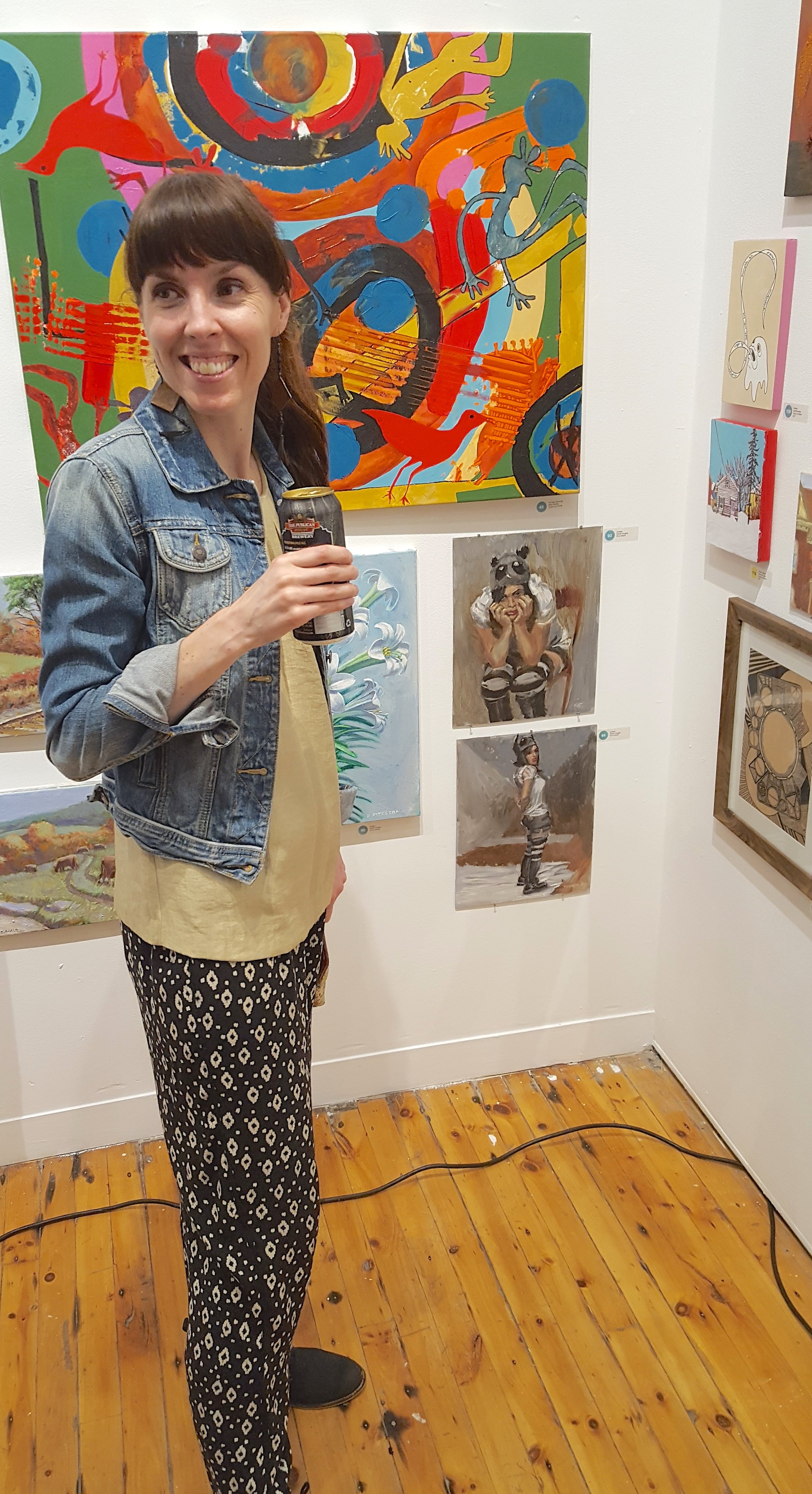
Me drinking beer.

Me drinking beer.

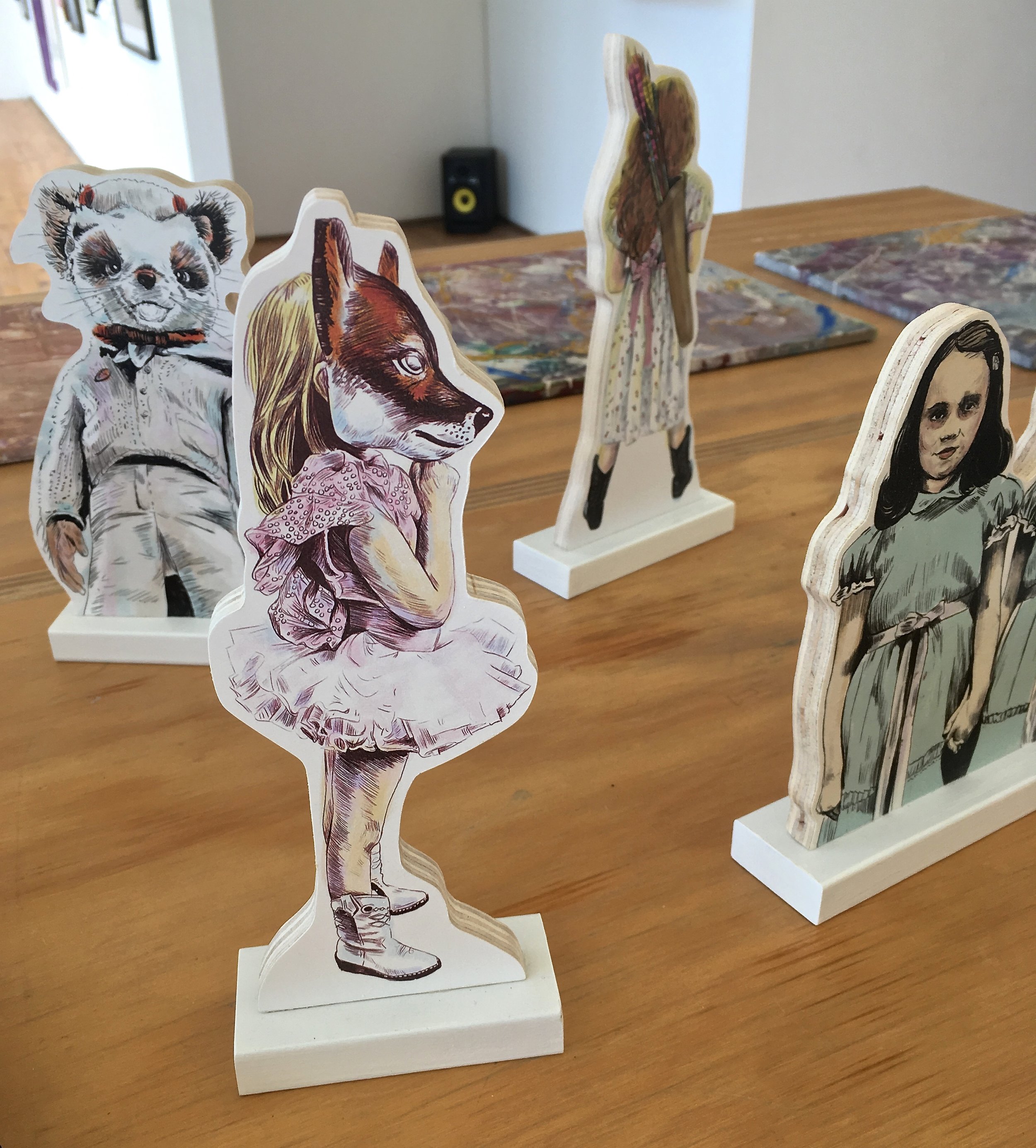
Here are a few pieces that caught my eye. The wooden standees are by a local artist Lucky Jackson shop online here.

During the preview I saw a few antique handsaw's by local artist Owen Dixon. My mother-in-law introduced me to his work last year & I knew that we had to try & get her one of his pieces for Mother's Day. 

There were two vintage saw's in the sale, this is the one I wanted. All of his torch work is free hand, check out the link above to see his more of his work.

There were two vintage saw's in the sale, this is the one I wanted. All of his torch work is free hand, check out the link above to see his more of his work.

I had to include one more photo from his website. A 1957 Chevy Chieftain door. Remember this is free hand plasma cutting, how talented is he!

We got it! My husband & I with the artist on the right.

We got it! My husband & I with the artist on the right.

One of my painting's on the top right.

One of my painting's on the top right.

The walls are getting empty near the end of the evening.  

The walls are getting empty near the end of the evening.  

Can't wait until next year! If you are a local artist or collector make sure you mark your calendars for next May.  

House Feature - Lauren Gordy

I discovered Lauren through Instagram & reached out to her to see if she would be up for sharing her home with us all on the blog. A few months later, here we are! Get ready to see a wonderful space that has been carefully curated. 

Her dog Acorn is ready for the tour!

Her dog Acorn is ready for the tour!

"I am certified in interior design and as of now I help friends and family style their homes. I am working on moving forward with an interior design business. My husband and I live in Wilmington, NC with our 3 rescue dogs; Noah, Elvis, and Acorn. In addition to sprucing up our home and interior design, we own a video production company. We work from the Tin Roof (our home) so it can be difficult to concentrate while thinking of all the things I could be rearranging and adjusting around the house. Hah!"  I also have a studio space where I paint in our home so I can totally relate to what Lauren is talking about.

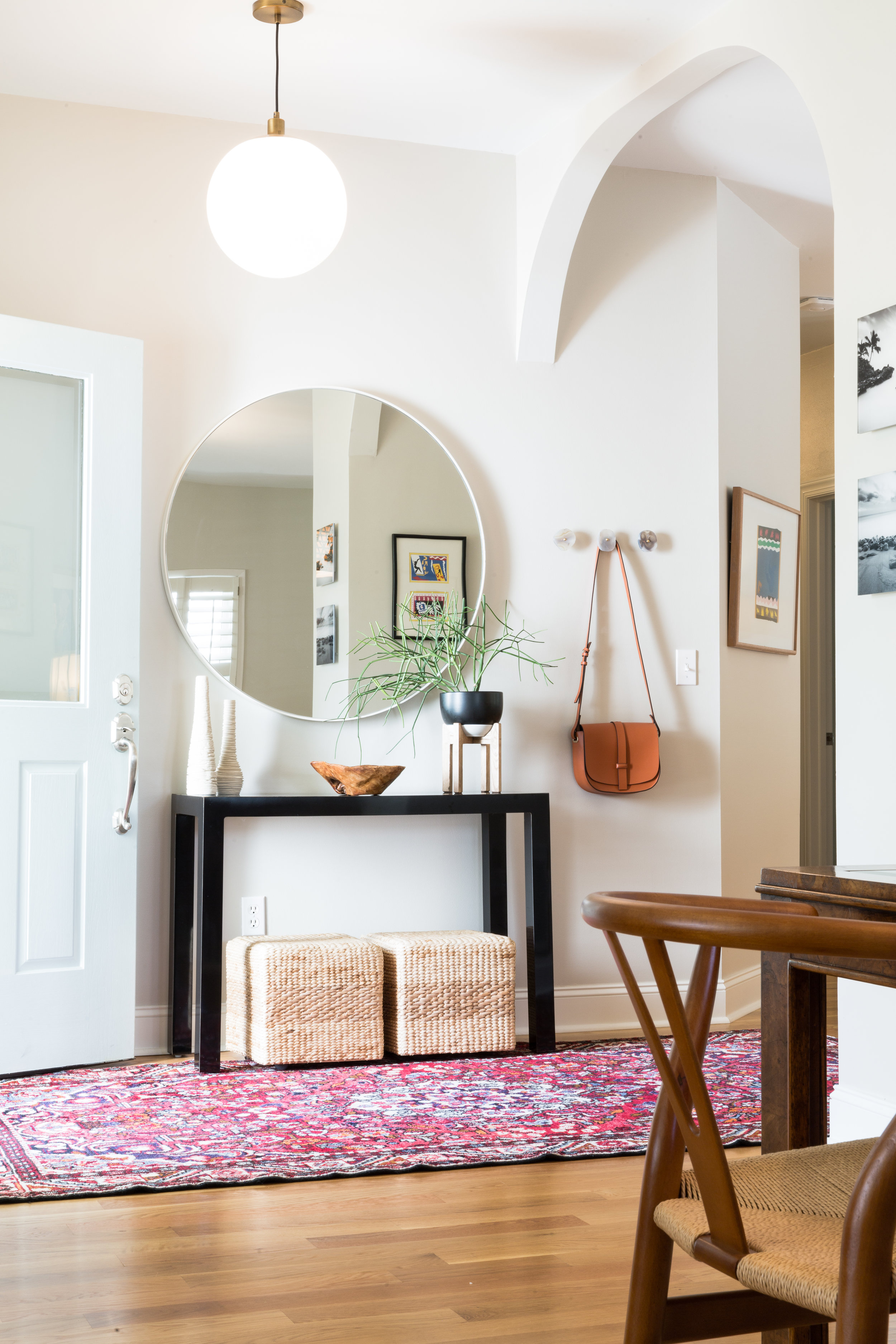
Even though the entrance is small, Lauren has given it so much personality. The addition of agate drawer knobs on the wall create a spot to hang your coat or purse. Lauren's Uncle made the wooden console & the mirror from Home Goods is the perfect focal point. The main living space is an open floor plan & can be seen from many angles, keeping things simple & uncluttered in the foyer helps with the flow.

A pop of colour is added in the dining room with the addition of a bench. I love the oversized cacti print. "From southwestern flare to Persian rugs, I am truly inspired by all types of design and I love to sprinkle a little bit of everything throughout the entire home."

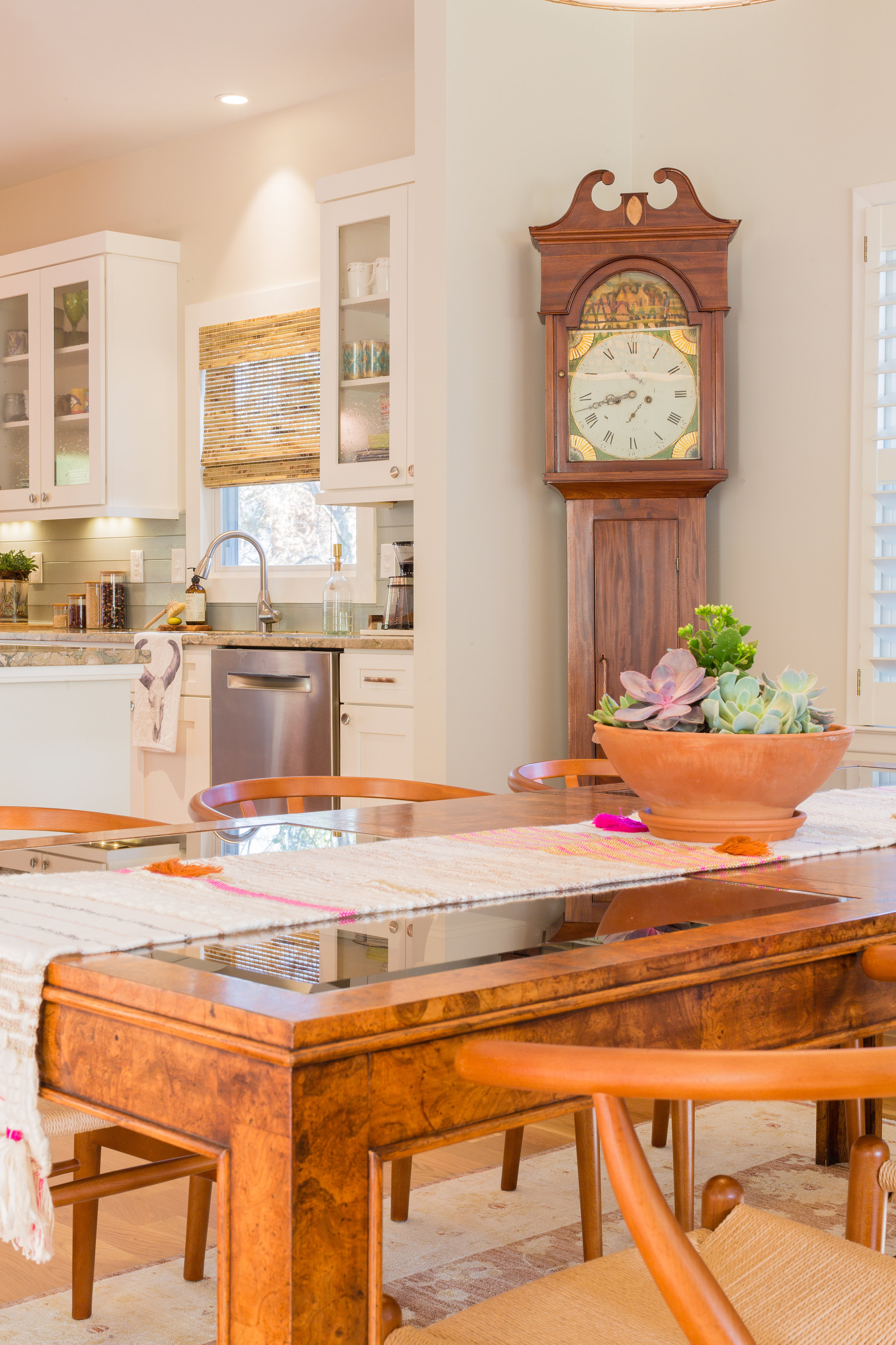
"The grandfather clock was my grandparents. It was made in 1816. We just recently got it working again. You can here it tic tock throughout the house...It's pretty special!"

"The grandfather clock was my grandparents. It was made in 1816. We just recently got it working again. You can here it tic tock throughout the house...It's pretty special!"

Lauren & her husband were lucky to find a home that didn't require any major renovations. The previous homeowners did a fantastic job on the kitchen. Considering that they only moved into their house last August, Lauren has done an incredible job making it feel like a home.

"We love our little eclectic home. It is surrounded by palm trees, succulents and beautiful foliage.  We are a couple miles from the beach, so it is nice to step outside and smell the salty air. Our outdoor space with the sunroom, back deck and pool, is the perfect little oasis to entertain friends and family! And of course, let our 3 pups run around and play."

This shot allows you to see the open floor plan. I'm so jealous that they can cook & watch tv at the same time! When they moved in they repainted and changed the light fixtures & blinds. Easy fixes for anyone who wants to add their own personality to a space.

Lots of comfy cushions create a welcoming spot to cuddle.

Lots of comfy cushions create a welcoming spot to cuddle.

"The record player was my father in laws and he generously gave it to us when we moved in. We have a ton of great records but my favorite is Fleetwood Mac for sure!" I also listen to a lot of Fleetwood Mac in our home, so I think we would hit it off. She has good taste folks.

The master bedroom is kept neutral with lots of texture. How stunning is this bed from Anthropology!

The master bedroom is kept neutral with lots of texture. How stunning is this bed from Anthropology!

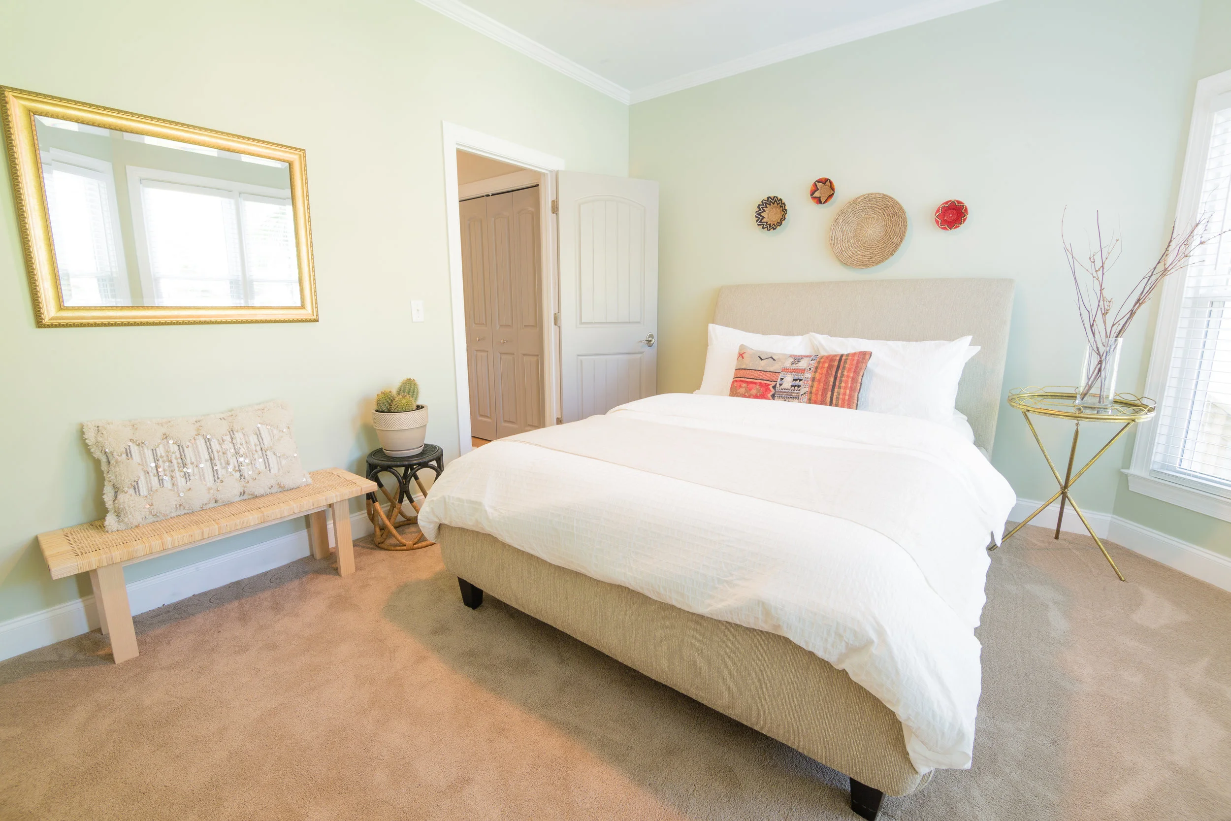
The perfect spot for guests to relax and spend the night.

The perfect spot for guests to relax and spend the night.

"My favorite room in the house is the living room. The room has large bay windows that bring in a ton of morning light. We love to sit in there each morning, drink our coffee, chat and hang with the pups. It's a great way to start the day."  

I love how Lauren has incorporated plants into the vignettes throughout her home. They really are an inexpensive element that adds a lot of character.

I love how Lauren has incorporated plants into the vignettes throughout her home. They really are an inexpensive element that adds a lot of character.

Our living room area rug is very similar to this pattern (my husband even noticed that) good choice Lauren!

Our living room area rug is very similar to this pattern (my husband even noticed that) good choice Lauren!

No corner is left untouched. Lauren has styled every inch of this home to perfection.

No corner is left untouched. Lauren has styled every inch of this home to perfection.

"I will forever love interior design and helping others turns their house into a home. It’s definitely my passion." Thanks for sharing your home with us Lauren, & I know you are going to succeed with your new business. 

Highlights of the week

I've been sick for the past few weeks, therefore lots of time has been spent sitting on my sofa surfing the good old internet. Here are some things that I'm excited about, in no particular order.

I recently discovered a new artist that I admire; Jeanette Sperone. She currently lives and maintains a studio in Northern New Jersey. The simplicity of the subject matter is what attracted me at first. Then I really fell in love with her colour palette and composition. These prints are wonderful and affordable.

"The Ever-Present Feeling of Neglect" prints starts at $40

"The Ever-Present Feeling of Neglect" prints starts at $40

"Avuncular Knots" prints start at $50

"Avuncular Knots" prints start at $50

Amber Lewis of Amber Interiors has amazing style and her designs are timeless in my opinion. This piece available in her shop is stunning!

The Lounger Daybed in natural.

The Lounger Daybed in natural.

We no longer have an Ikea store close to home. We visited friends out of town during March Break and made a pit stop. We left with only a handful of items, very proud of myself as I loved a lot of the plants they had.

Ikea's Mastholmen collection has some great pieces like this loveseat. With the popularity of rattan you could style it in an indoor or outdoor space.

Ikea's Mastholmen collection has some great pieces like this loveseat. With the popularity of rattan you could style it in an indoor or outdoor space.

I just re-watched Season 3 and can't wait for next week's premiere! If you haven't watched this show your missing out, it's hilarious.

I just re-watched Season 3 and can't wait for next week's premiere! If you haven't watched this show your missing out, it's hilarious.

Design & photograph by Holly Hickey Moore.

Design & photograph by Holly Hickey Moore.

This photo really makes me want to go outside and do all of the yard work that needs to be done when Spring arrives. Our daughters are eager to go play in the back yard, but I have to clean up some remaining winter dog poop first! I have a few more Plant Studies to finish before I tackle it. May 1st I hang my show at a local Craft Beer Cafe, if you are local, details will be in my next newsletter.

This week I did something I'm quite excited about. During both of my pregnancies I developed Varicose veins in my legs. I still suffer pain in one leg as a result five years later. I've finally booked laser surgery to remove it in early May. If you don't know what they are I won't go in to detail, I'll just say they are green swollen veins. If you are still reading this, I need to add that I don't wish them upon anyone!! They are no fun. Unfortunately the procedure is not covered by OHIP (insurance) and quite expensive. 

I've donated this painting for a local fundraiser this Saturday April 22nd at Holiday Ford. The proceeds will go towards Hospice and St. Catherines Public School (Peterborough, ON). 

Coming Soon

A few weeks ago I discovered a unique shop in New York, and as I looked through their website I got so much inspiration to create a new painting. Vintage furniture and a variety of quirky home goods make this design shop in Lower East Side a must see.

 “We’re basically always playing house,” says Fabiana Faria, who opened the airy Lower East Side design shop Coming Soon with partner Helena Barquet." “The concept is something that will always be evolving. But what we want and look for are fun, original, well-made tools that bring you some happiness.”

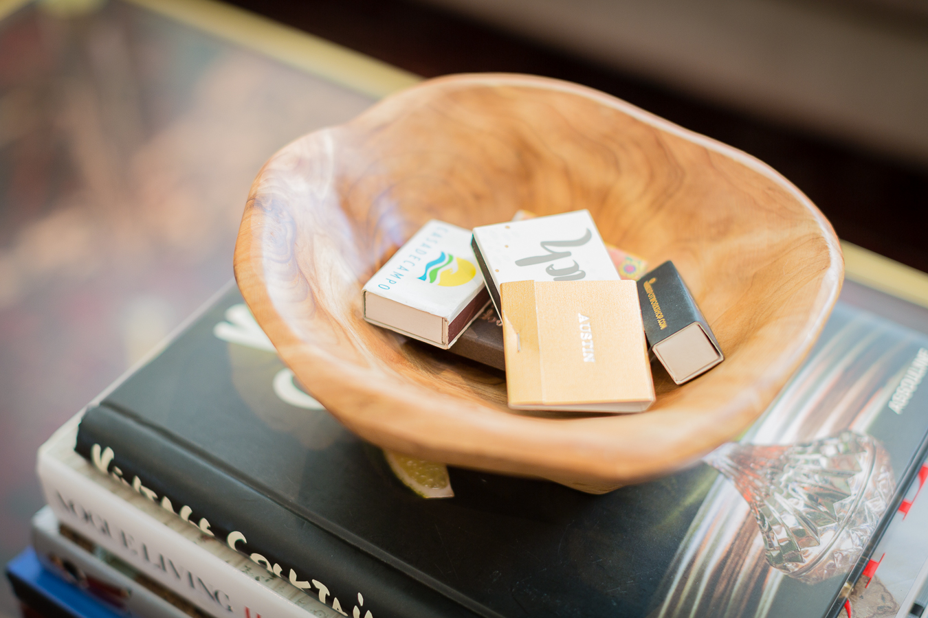
These images and colour combinations were in my mind as I painted. This is a rug they offer & this neon logo reminds me of the 80's classic "Cocktail"!

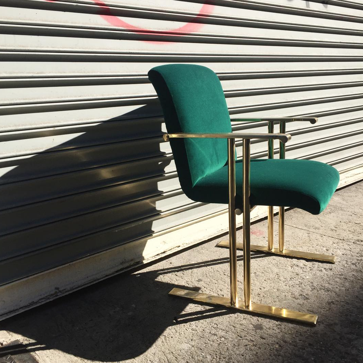
A vintage 70's brass chair got a makeover with this emerald green velvet.

A vintage 70's brass chair got a makeover with this emerald green velvet.

This is my most textural Plant Study piece so far. I love the bits of mauve peeking through the coral background.

This is my most textural Plant Study piece so far. I love the bits of mauve peeking through the coral background.

Love this vignette!

Love this vignette!

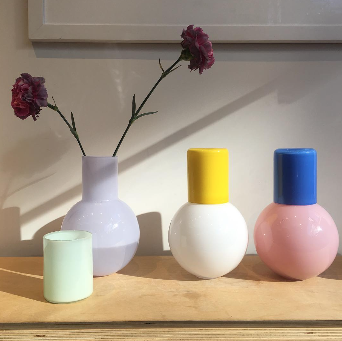
Colourful Carafes by Anna Karlin Studio.

Colourful Carafes by Anna Karlin Studio.

Primary colours joining together in this table top.

Primary colours joining together in this table top.

How fabulous are these modern chairs.

How fabulous are these modern chairs.

This Octavia bowl by Concrete Cat comes in so many colours. Check out my post on this Canadian Company.

This Octavia bowl by Concrete Cat comes in so many colours. Check out my post on this Canadian Company.

Theses Fan Palm leaves look great on this Kelly Wearstler inspired pattern. I'm dreaming of summer can you tell.

Theses Fan Palm leaves look great on this Kelly Wearstler inspired pattern. I'm dreaming of summer can you tell.

This painting will hang with a collection of Plant Studies in May. If you are interested in it please contact me directly. Hope you all have a great long weekend!

Architecture = Inspiration

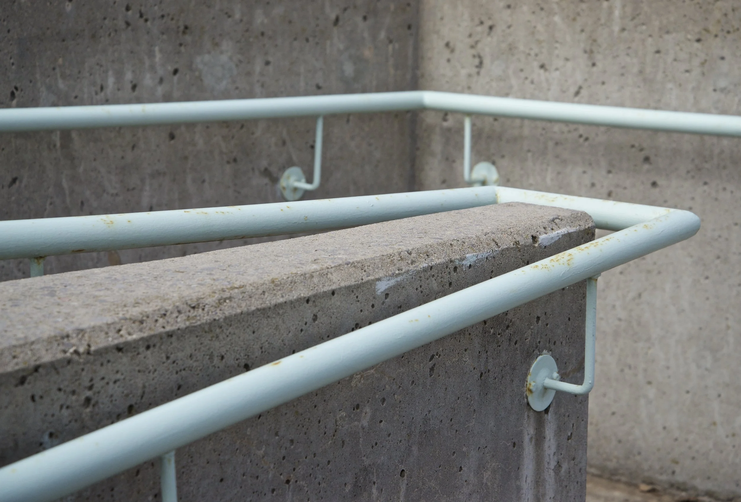
The other day I decided to grab the camera, hop in the car, and go explore. I drive by a particular stair case a lot and always think to myself that I should go snap a photo. The accent colours are yellow and mint green, a great combination. I parked my car outside the retirement home and headed to the stair case and adjacent ramp.

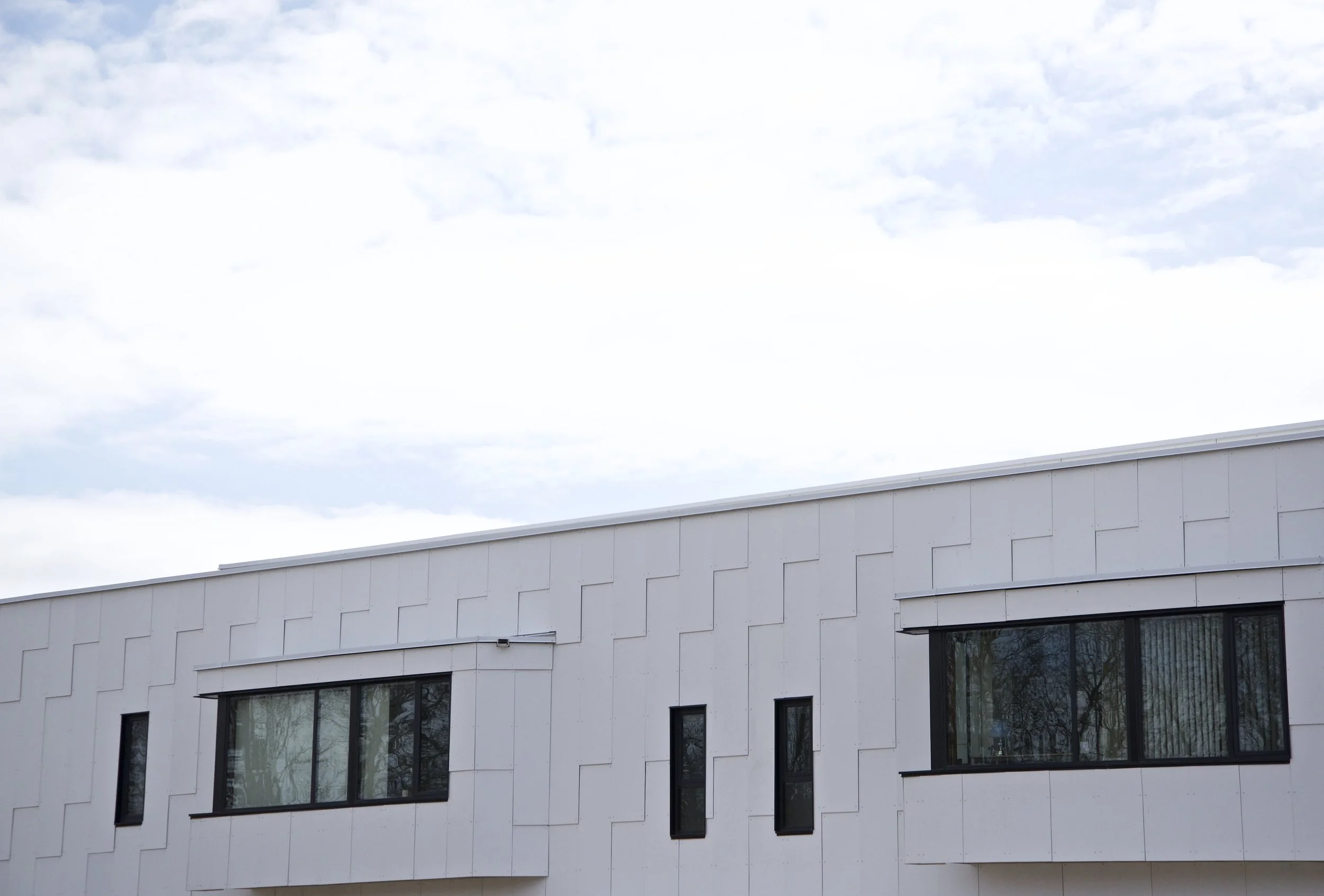
Behind the retirement home is a modern building that I only had ever seen the top of while driving by. I didn't even know what it was until I walked closer to it. I'm so glad I had my Nikon camera with me and not just my cell phone. I was blown away by this architecture. This is five minutes away from my house, why hadn't I seen it before? We have lived back in my hometown of Peterborough for only 3 1/2 years, this building was built before that time I discovered.

I didn't take an exterior shot of the entire building, this photo is by Teeple Architects.

I didn't take an exterior shot of the entire building, this photo is by Teeple Architects.

Who lives here I thought? I went home and did some research. The Sisters of St. Joseph Convent is built here and is on the property of the old heritage building that they used to reside in. "The Sisters’ vision for their home was for a simple, modern environment that would be permeated by openness and warmth. They expressed a desire for the interior spaces to be bathed in daylight and to be crafted from high-quality, natural materials."

"The concept for the new convent was to create a series of ribbon-like curved surfaces that would allow the landscape to flow into, around and over the building."

I can't wait to go back on a sunny day when the trees are in bloom and walk on the grounds again. I have always been drawn to the repetition of shapes. I think this is why I like the exterior that is clad in white cement panels so much. The simple and modern design is unlike a lot of buildings in my neighbourhood. While I browsed the architects site I found a few interior images that I will share. I also learned that they built the library I used to take my daughters to when we lived in Burlington. Our library is currently being renovated and updated, I can't wait to see it once it is completed this summer.

This room is now the chapel. Photo is by Teeple Architects.

This room is now the chapel. Photo is by Teeple Architects.

These curved lines remind me of the interior of the Guggenheim. Photo is by Teeple Architects.

These curved lines remind me of the interior of the Guggenheim. Photo is by Teeple Architects.

I lost track of time while I photographed the building...40 minutes later I got in my car feeling as though I had just discovered a hidden gem. Like many other artists I do find inspiration from walking in art galleries. I find it's easier for me to pay attention while I'm walking or driving and really look at the colours and textures of houses and structures I pass by. Architecture is something my husband and I both enjoy. You might enjoy this post of Frank Lloyd Wright from last year.

Gallery Representation

I honestly still feel pretty new to the art world. After I graduated with my BFA in my early twenties I did not practise painting for a long period of time. I would dabble in projects here and there for myself and family, experimenting with various techniques. It's only recently that I have developed a consistent style that I am really happy with.

That being said, I certainly don't feel like I am ready to go conquer the art world. My confidence is building up and my personality has always been outgoing...I'm far from shy. Sometimes I think I need to know more about my local gallery scene.

This post idea came to me a few weeks ago as I received an email from a Gallery in Chelsea, New York. They asked if I would be interested in more information about representation from them.  After I read the documents I told my husband I would need to win the lotto to afford this. They require a substantial amount of money upfront which seemed a little unsettling. I will also add that they took only 30% of sales which is not what I thought was the "norm". I sent this email to a friend of mine who has representation in London & the US, she verified that this sounded strange. "Thank goodness, I thought to myself!" 

I've asked a few friends I've met online to share a bit about their experiences with the galleries that represent them. They are all very talented women that can paint anything; people, animals, abstracts, you name it! I hope other creatives will find this as useful as I have. First up is Elaine Burge an artist residing in Riddleville, Georgia. You can see more of her work on her website.

Here Elaine is doing a live event painting at a wedding. What a fabulous idea.

Here Elaine is doing a live event painting at a wedding. What a fabulous idea.

"I have always loved to create. For as long as I can remember, the urge to make things has been a leading factor in my life. I assisted a muralist in high school and then painted scenery behind miniature train layouts while in college studying Graphic Design at The University of Georgia. I worked as a web designer in Atlanta for a couple of years but that lack of the tangible final product was leaving me unfulfilled. I needed to throw paint at a canvas. I met my husband and he told me that he thought I could pursue art full time, so I did. One $100 portrait at a time... I finally gained enough courage to start painting wildlife and abstracts (spontaneous creations, if you will) and somehow came across Gregg Irby Gallery in the process. I believe my friend Whitney Durham, who is an interior designer in Atlanta told me about the gallery. I was delivering a painting in Atlanta one day and decided to stop in. I immediately knew that these paintings had to be friends with mine. They would be best friends!"

A one of a kind portrait that Elaine recently completed.

A one of a kind portrait that Elaine recently completed.

"So I sent in an artist submission on the site and it took months to hear back. Gregg was interested in a couple of pieces and asked if I had more to show. Because I was working mostly on commissions, I had little to show. I sent what I had and then the next time I was in Atlanta, which happened to be for a live event painting, I stopped in and shook Gregg's hand with high hopes and low expectations. By the end of the conversation, she asked me how long it would take to get 20 paintings to the gallery... I was beside myself and will never forget it. I went back to my little 15'x15' studio and began the next phase of my creative life. Gregg had me sign a contract that allows 50% commission on all pieces sold. She charges extra for shipping and the contract is 18 months. I am not allowed to make prints of pieces sold through the gallery and if a client finds me through the gallery and wants to do a commission, she gets 50% of the profit. I would reach out to galleries that you feel you fit in well with!"

Andreina with some of her artwork before it is shipped off to galleries across the US.

Andreina with some of her artwork before it is shipped off to galleries across the US.

Andreina Bates is an artist residing in Jupiter Florida. You can see more of her work on her website. I asked her to share a bit about herself and this is what she had to say. 

"I am originally from Venezuela but haven been in the US since I was 17 (a long time ago, don’t do the math ;)).  I have twin boys that are 7 and keep me busy…and a job, not art related.  I have always been curious and creative and typically jump from hobby to hobby.  I’ve been into digital illustration (even had a little etsy shop that was successful!), photography, writing, sewing and then, one day, I found painting.  Actually, a good friend of mine gave me a watercolor painting of my house a couple of years ago and I was amazed that 1) she could paint and I had no idea and that 2) adults with jobs were allowed to paint ;))  So I got curious and got a watercolor set and that was it….haven’t stopped since!"

I love the colours in this Lifeguard shack by Andreina.

I love the colours in this Lifeguard shack by Andreina.

"I am actually an Industrial Engineer and growing up always considered being “analytical” to be my biggest strength.  I was able to break down complicated problems and find the solution, so engineering seemed like the right path for me.  It is funny how the two “sides of me” often merge because I feel like the analytical/engineer part of me often influences my paintings too.  I didn’t take my first art class until a year ago, when I took a watercolor class at my local art center.  I really enjoyed the class and loved meeting the people that were there too (mostly older/retired people, but with a big love for just painting for the sake of creating)." 

"So as I mentioned, I have a job…which means I don’t paint full time.  This is why I chose galleries as my path to sell my work.  I know many artists are very successful selling their own work, but I found it to be easier to let someone else take care of that part for me. I approached most of the people I'm working with. I don't think that's a bad thing...they wouldn't have known I existed otherwise.  I am very lucky to be working with some really amazing galleries and have learned a lot in the process."  Andreina is represented by Stellers Gallery, Kristen Coates, Well & Wonder, Destination Haus and House Of Arts.

"They all take a commission and in their contract will specify how sales would run (if they do any). Most of them take 50% commission and like to have an end date to try things out. Most of the them also ask you to pay to ship works to them. I don’t wait for opportunity to come knocking at my door, usually I’m knocking.  I think that would be my biggest piece of advice, go for your dream, knock on some doors.  Chances are most doors will ignore or say no thanks, but the ones that do are the ones that matter.  I also think it’s important to visualize the kind of artist you want to be….then decide if your actions are taking you closer or further from that image."

Laura paints from her home studio and finds inspiration comes from mid-century living, particularly the idyllic California lifestyle.  

Laura paints from her home studio and finds inspiration comes from mid-century living, particularly the idyllic California lifestyle.  

Laura Browning is an artist residing in The Bay area. You can see more of her work on her website. If you want to learn more about Laura please read this inspiring essay she wrote for COTFA"My experience with galleries has been very positive and has brought a great amount of exposure to my work.  A few years ago, I participated in some group shows here in San Francisco.  Those shows typically exposed me to local collectors, many who found my work on the gallery website after the show was over, and contacted me looking to purchase.  It’s only recently and after an extended break from painting that I can say I am represented by a gallery." 

"Currently I am represented by Elliott Fouts Gallery in Sacramento & Destination Haus in the Hamptons. I am in the very early stages of being represented by two other galleries - meaning I’m creating a body of work to send to them soon.   I’m also showing at Legion here in San Francisco - “showing” being a bit different in that my work is being hung for a period of time, but the gallery does represent artists long term. Although the relationships have all been a bit different - every gallery I have worked with has been the same in terms of $$.  They take a 50% commission - and we split the difference if the piece is sold at a discount (and that discount is usually up to 10% and specified in the contract).  Shipping and or delivery to the gallery is typically to be paid for by the artist."  

Laura's most recent body of work is inspired by "the pattern and movement of light reflections in water."

Laura's most recent body of work is inspired by "the pattern and movement of light reflections in water."

"How I connected with these galleries is a bit varied.  The group shows- I submitted my work for consideration and they expressed interest.  They planned a specified time period to hang my work when there was a show with a theme that my work fit with.  Then they included a handful (4-6 pieces) in that show.  With Elliott Fouts Gallery, I sent them some images of my work last Fall, when they were looking for new small pieces for a group show.  They loved my work and chose to hang 6 small pieces.  Although it wasn’t spoken, I knew it was a bit of a test to see the response to my work. Even though they loved the work, they likely needed to gauge the response from their clients. The response has been good, so now we’ve moved on to larger pieces.  Legion, the gallery here in SF found my work through EF Gallery and contacted me."  

"What I know, and have learned from talking to these gallery owners:  They get TONS of submissions. Tons.  They KNOW their clientele, and can pretty quickly predict if their clients are going to respond to the work that is being submitted.  In order to take on a new artist, they will typically have to take wall space away from another artist, and that is a gamble on their end so that makes them even more picky particularly if the artists they represent currently are selling.  Knowing this makes it my goal to be the artist that they don’t lose the gamble on.  I start my outreach by looking for galleries that have art I truly believe is a fit with my art.  Both in terms of style and size and price.   Some galleries tend to only show very large works, and others small, higher/lower price point …  you get the picture." 

"Online galleries are an alternative worth considering.  I am on Zatista, Saatchi and Artfinder.  I’ve been with Zatista for 6 or 7 years and they have consistently sold my work.  They all do a lot of work to promote the artists - and over the years my paintings have been placed in temporary collections on One Kings Lane, Design Public, etc.  They take a smaller percentage (between 30-40%) because obviously they don’t have the overhead that a gallery has.  There are no fees to list your work with these online galleries." 

Image by Holly Becker.

Image by Holly Becker.

No matter where you are in your creative journey remember that if you show up, work hard , and set realistic goals for yourself anything is possible. I read lots of inspirational quotes on Pinterest  trying to find the "perfect one" to share. Reality is, lots of the artists I've met through social media are working long hours with early mornings, kids, hustlin' to get everything they want to achieve done in a single day. Things aren't picture perfect, and lots of us have big dreams. You can and should pursue your goals, knock on some doors and introduce yourself!

International Art & Design

The other day I was online and it occurred to me that I was drawn to a variety of sites from around the globe. If I won the lottery and could travel anywhere in the world, Australia would be my first stop. The art and design community there is so inspiring.

I enjoy every house tour I browse on the Design File website. The plants in this room caught my eye, I'm very inspired to create something similar on canvas. This is the home of Australian artist Miranda Skoczek. Photo from the Design Files. 

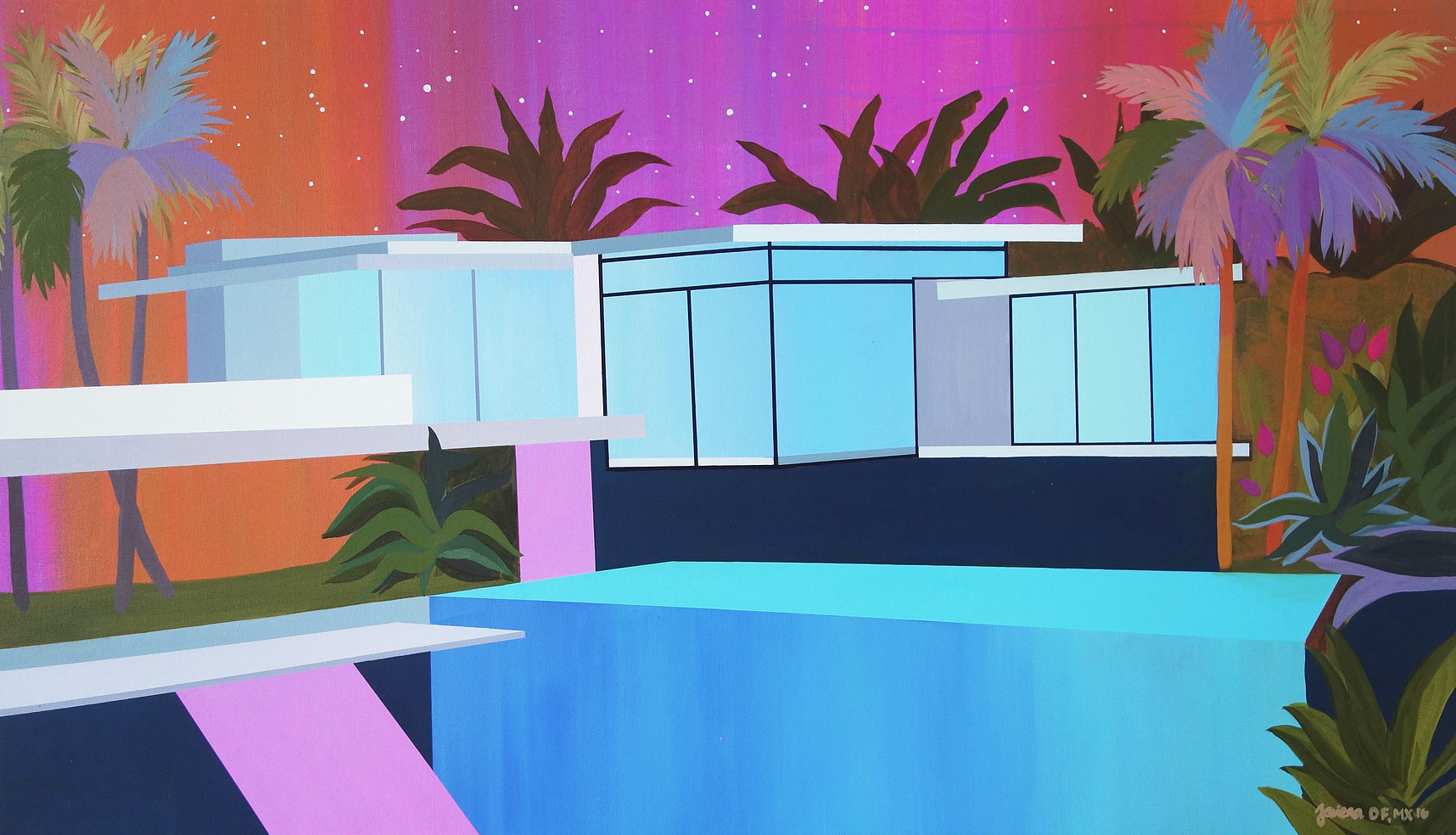
Behind by Javiera da Fonseca

Behind by Javiera da Fonseca

As soon as I opened up my email, there was "Art for your Inbox" from The Jealous Curator. I was excited to see the colourful work of Mexico City based artist Javiera da Fonseca. When I checked out her portfolio I honestly could not pick a favourite painting. Every single image is stunning! I love mid-century architecture and she does it so well. If you are in Vancouver check out her exhibit at Back Gallery Project.

Refugio FX by Javiera da Fonseca

Refugio FX by Javiera da Fonseca

The photo below is from fenton&fenton a design shop in Australia. I was blown away to see all of the wonderful artwork they carry from over 20 local artists. I was a little envious to be honest, I would love to a collaboration similar to this one day. A girl can dream right!

This outdoor collection is perfect for the warm climate they have. There is still snow on the ground outside my window even though it is officially Spring. The planter on the left was inspiration for my painting Plant Study #9.

This outdoor collection is perfect for the warm climate they have. There is still snow on the ground outside my window even though it is officially Spring. The planter on the left was inspiration for my painting Plant Study #9.

"Lucy Fenton established fenton&fenton inspired by her experiences backpacking around the globe. From vintage to avant-garde, the furniture collection accords with vivid textiles, one-off curios, artwork and jewellery to create a highly sought after look. Lucy has created an emporium filled to the brim with colour and texture, a haven for creativity where you are bound to find the object of your desire!" 

They also offer services to help you decorate and style your home for resale purposes. I personally don't know of any retail shops in Canada that also offer staging as well. A fantastic idea in my opinion. "Adding warmth, texture and interest to a space is key when selling. Not only does it make prospective buyers instantly feel at home, it helps them visualize how they too can create a space that is welcoming, liveable and personal."

Artist Helen McCullagh reinterprets the still life genre in a modern context in her work.

Artist Helen McCullagh reinterprets the still life genre in a modern context in her work.

Meet my new girl crush...Megan Grant. I'm in love with her style & fell down a rabbit hole while browsing her IG feed.

Meet my new girl crush...Megan Grant. I'm in love with her style & fell down a rabbit hole while browsing her IG feed.

The painting leaning against the fireplace is by artist Carly Williams. Some elements in her work remind me of the mobiles by Alexander Caldwell. The small cactus piece on the mantle is by the talented Kate Jarman.

The painting leaning against the fireplace is by artist Carly Williams. Some elements in her work remind me of the mobiles by Alexander Caldwell. The small cactus piece on the mantle is by the talented Kate Jarman.

The graphic patterns in the work of Ali Wood are a modern juxtaposition to the floral arrangements. I think they look wonderful grouped together in this vignette.

The graphic patterns in the work of Ali Wood are a modern juxtaposition to the floral arrangements. I think they look wonderful grouped together in this vignette.

The connection between interior design and original art is an important one. Good designers & decorators understand that artwork really does make a space come alive. Whether it's a gallery wall or one statement piece, artwork helps balance all of the other design elements in a room.

Accessible Art

Last fall I had the opportunity to display my artwork at a popular restaurant in town. It was on display for several months and I thought it enhanced the space quite well. I created this body of work for my first solo exhibit that was last June. The interior of the gallery was similar to the main wall in the restaurant with exposed brick. I lucked out as the owners did not take any commissions from my sales. They just want to support local creatives, and I am so thankful for the opportunity I was given. As an emerging artist in my community this is a great way to get my name out there. If you are an artist who is contemplating your next step, I recommend contacting local cafes and restaurants.

I installed on a day the restaurant was closed. I snapped this photograph to show my daughters.

I installed on a day the restaurant was closed. I snapped this photograph to show my daughters.

"The connection between food and art has never been greater." I read this in an online article by domino magazine and I thought I needed to share it. One of the restaurants they include has "the largest private collection of Andy Warhol works in a public space." Can you imagine dining and viewing some of his original silk screens at the same time? I love his work and can only imagine this experience. http://domino.com/restaurants-with-best-art-and-decor#8

My original painting "Who You Are".

My original painting "Who You Are".

A customer recently inquired about this body of work, asking if the painting above was still available. I offered to bring it over so she could see it in her home, she decided it was meant for her. She has great style and I was thrilled to see where she planned on hanging it. I have just began a relationship with this collector, and it was the second piece she has of mine. I asked her to share a bit about how she discovered my artwork and this is what she had to say.

"I first came across your art at Two Dishes. I was there for the Green Eggs and Ham (so good!!) but also always love seeing the local art they have on display in there. I really loved the whole collection that was displayed, and there was one piece in particular that really caught my eye. Every time I went for brunch and got to admire the piece once more, it really solidified how much I loved it and helped me imagine what it would look like in my own space. Being able to view the collection in such an informal way made it seem more approachable and accessible. I went for the food but ended up finding a beautiful piece of art for my home!" 

"I like the idea that you can unintentionally stumble upon an awesome piece of art by a local artist while you're out for dinner, brunch or coffee.  Like I mentioned previously, it makes art feel a lot more accessible and artist's exhibits aren't just confined to the typical gallery setting."

I feel very lucky that I am able to paint and my local community is helping me exhibit my work. I'm busy creating more plant study pieces for my next show at a local Craft Beer Cafe in May.

My Creative Process

Today I found myself questioning my work for a brief moment. "This seems too easy, so effortless" I thought to myself. I have been experimenting and creating full time for a year and a half. During this time I have been envious of artists that have a distinct style, and create a body of work that is original. I now feel like I am doing what I was meant to do and my palette knife is my tool of choice.

This was the first thing I photographed today, it seemed fitting to share on International Women's Day.

This was the first thing I photographed today, it seemed fitting to share on International Women's Day.

I have a show coming up in a few weeks and I am painting lots of plant studies to exhibit. I've noticed that I have had a lot of positive feedback about my colour choices in each piece. My friend Eva told me my palettes are "dynamic". Today I finished two pieces and then decided I needed to photograph them at a local skateboard park near my home. I had 20 minutes before I got my daughters from school and the rain started to fall. I want to share a few photos that got me excited.

Graffiti is my jam. I love the texture of the chipped paint and the patterns and overlapping colours. My work has been inspired by street art ever since I can remember. When I travel I am always on the lookout for a great wall to photograph.

Those black and turquoise marks in the concrete are SO GOOD!!

Those black and turquoise marks in the concrete are SO GOOD!!

My eye is drawn to the mint green in the top right corner.

My eye is drawn to the mint green in the top right corner.

I painted the vase first on this canvas, it was inspired by a piece of orange pottery that was my Grandma's.

I painted the vase first on this canvas, it was inspired by a piece of orange pottery that was my Grandma's.

I recently read something that said "You never know who you are inspiring" I want to share that I started this blog because an artist I admire said she recommended it. I was listening to a podcast featuring Michelle Armas, I thought to myself "I don't know what I'm going to write about but I'll give it a shot." I love sharing here and decided early on that I did not want to have people leave comments on posts. I am doing this for myself, if no one reads it that's fine. When I launched this collection I never imagined that my first sale would be to my "girl crush" Michelle Armas. I was so overwhelmed with happiness. Believe in yourself, stop thinking and just do it!

House Feature - Kate Lines

Kate, her husband Landon and their daughter Lula lived in this home in Arizona for several years. I reached out to her in December about sharing their home with me. The family has recently packed up and began a new chapter in Ontario, Canada. Unfortunately we are 6 hours away from one another, or I would have her over to chat about art, design and her newest baby on the way.

Kate's friend Tiffany Haynes snapped this stunning shot, I had to include it.

Kate's friend Tiffany Haynes snapped this stunning shot, I had to include it.

"We bought our house with the intent to completely renovate! At the time we were living in the Phoenix Arizona area, a city known for it's sea of tract homes. While tract homes have incredible neighborhoods and parks, we've always known that wasn't for us. My husband and I have both always loved ranch style homes, something we actually talked about when we we're dating! (I loved that he had an opinion on homes!) We house hunted for a full year before this one fell into our laps. We pulled up and both said "this is our house."

Kate searched for a mid century style door with no luck. Her husband bought a solid door & created this master piece! The pop of yellow paint screams summer to me, I'm very jealous as it is winter here.

Kate searched for a mid century style door with no luck. Her husband bought a solid door & created this master piece! The pop of yellow paint screams summer to me, I'm very jealous as it is winter here.

How fun is this mid century style mailbox!

How fun is this mid century style mailbox!

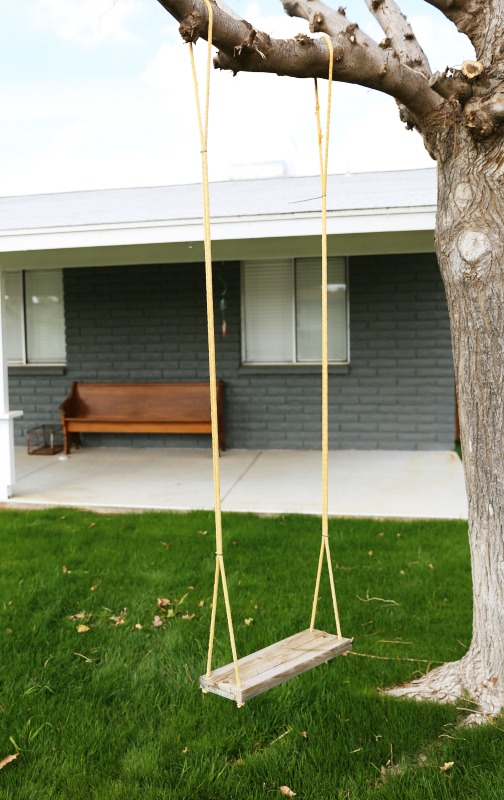
What little girl wouldn't love a swing in her front yard?

What little girl wouldn't love a swing in her front yard?

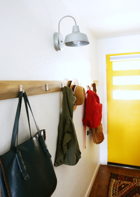
The addition of wall hooks are very practical & stylish in the entryway.

The addition of wall hooks are very practical & stylish in the entryway.

"I change my gallery wall every 6 months - at least." I will never tire of a good gallery wall, we have several of them in our own home. Kate has such a great eye for styling spaces, I've seen numerous of her past projects online with Jenny Komenda & Juniper Studios. This lady's got skills ya'll! 

"I have a strong belief that your home should be filled with art and color and life. I also know that art can be, in a word, expensive. My goal is to make art more accessible." Check out her online shop where you can buy the print, receive a digital download via email, and have it printed in any size and wherever you dang well please. How easy is that! 

The combination of textiles, paintings and some of Kate's original photography add to the eclectic design in this home.

The combination of textiles, paintings and some of Kate's original photography add to the eclectic design in this home.

That cactus is so textural, I need to paint it!

That cactus is so textural, I need to paint it!

A comfy spot to relax and unwind.

A comfy spot to relax and unwind.

Kate's in-laws gifted her the piano her first Christmas with them. Such a thoughtful gift.

Kate's in-laws gifted her the piano her first Christmas with them. Such a thoughtful gift.

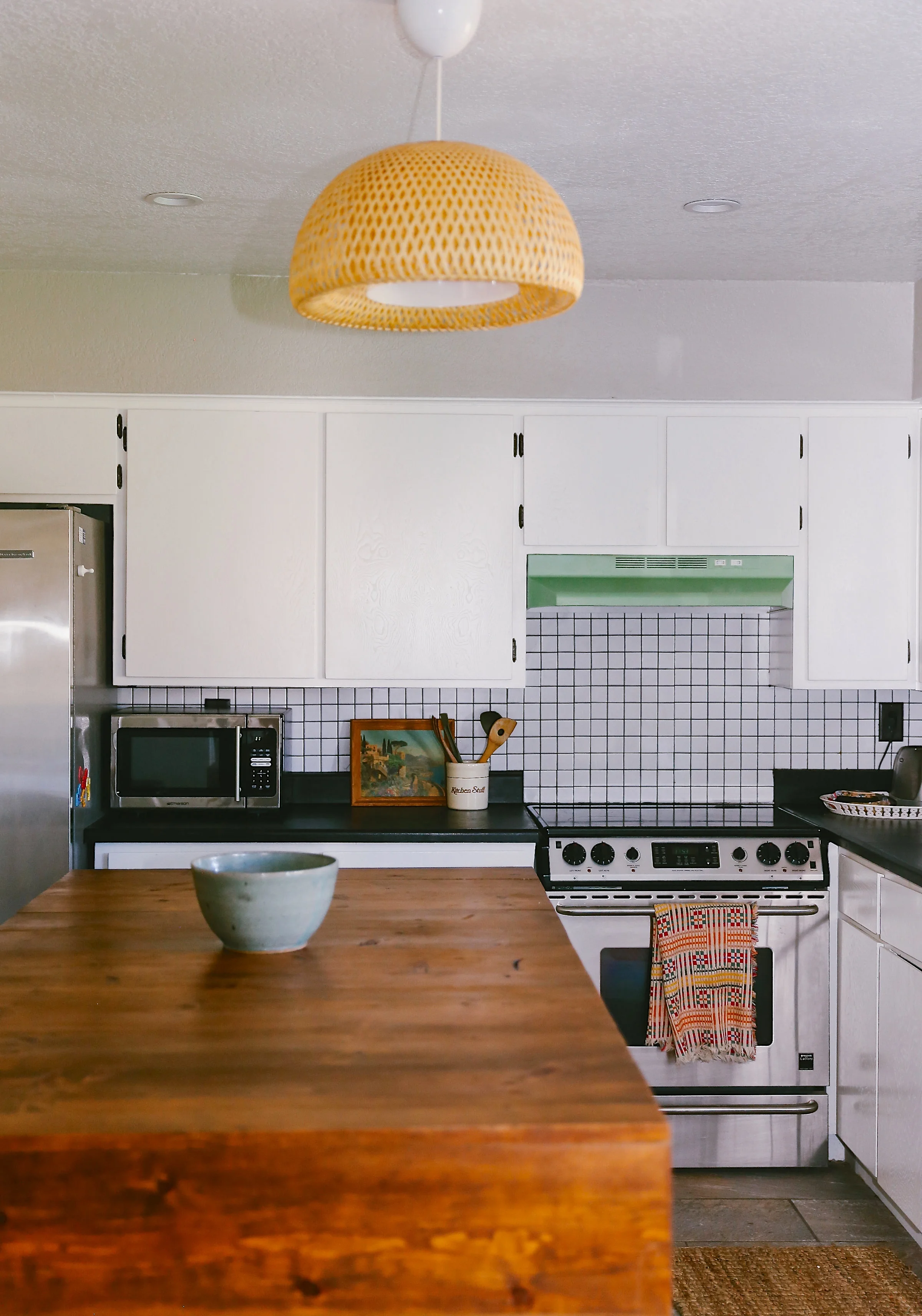
"We raised the ceiling, painted the cupboards/walls/countertops, and replaced the linoleum with tile. The kitchen is kind of a tricky layout so Landon built the big island and we use it as a table with bar stools. It's definitely the most changed room in our house!"

Kate spray painted the range hood green. An inexpensive way to add a vintage element to your space.

Kate spray painted the range hood green. An inexpensive way to add a vintage element to your space.

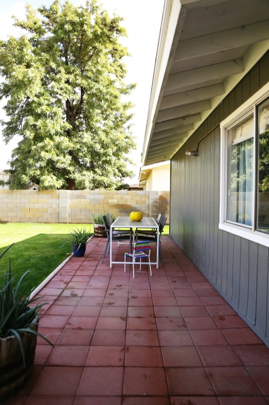
With the warm climate I'm sure these doors were always open.

With the warm climate I'm sure these doors were always open.

The grey exterior gives the house a modern look.

The grey exterior gives the house a modern look.

I love the patterned tile, such a graphic element in a small space.

I love the patterned tile, such a graphic element in a small space.

"We went with a floating sink to open up this tiny bathroom."

"We went with a floating sink to open up this tiny bathroom."

Who says you can't have artwork in the bathroom? These colourful pieces are by Beth Allan Art.

Who says you can't have artwork in the bathroom? These colourful pieces are by Beth Allan Art.

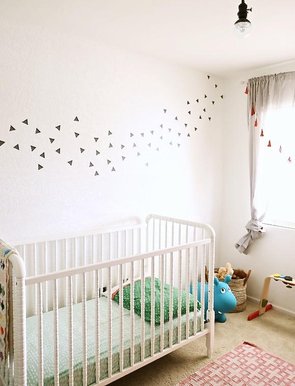
Lula's nursery is so whimsical & dreamy. The vintage dresser was a $40 Craigslist find.

Lula's nursery is so whimsical & dreamy. The vintage dresser was a $40 Craigslist find.

Kate's favourite Brian Kershisnik print (in the black frame) hangs amongst some of her photography in this corner gallery wall.

Kate's favourite Brian Kershisnik print (in the black frame) hangs amongst some of her photography in this corner gallery wall.

"We did everything from scraping popcorn ceilings to landscaping, and raising the kitchen ceiling to knocking down walls. We did every step of it ourselves, it helps to have a handy husband and opinionated wife. We learned for next time what we'll hire out and what we'll do ourselves, but every room and corner is a memory for us." 

Thanks for sharing your home with me Kate, I look forward to the day we meet...maybe a summer road trip to Toronto? I hope you enjoy living in Canada!

Plants, plants and more plants!

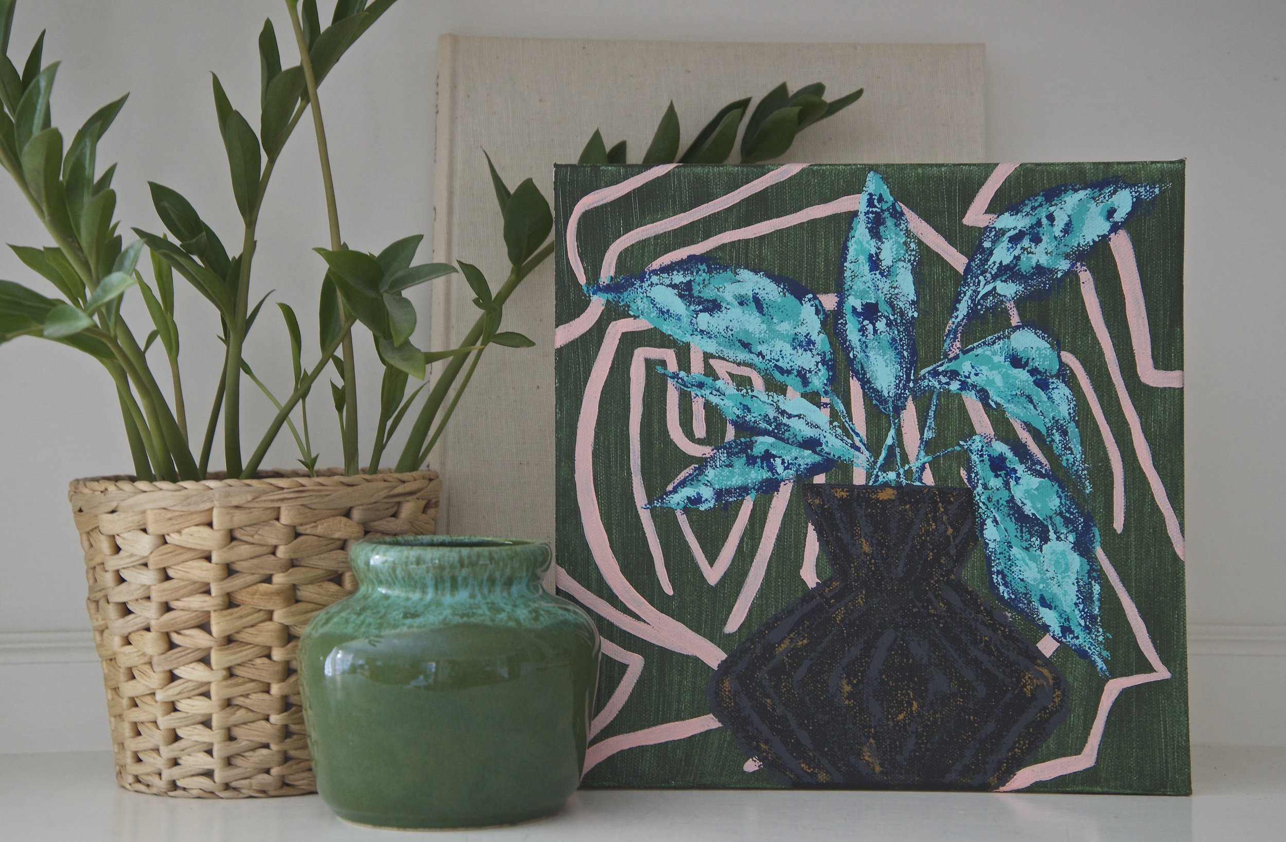
If you are the type of person who can't keep a houseplant alive, maybe I've got your solution. How about a painting of a modern plant that you can keep & style in different rooms forever! If you like the look of greenery in a space, I've styled a few vignettes so you can imagine them in your own home.

Make sure to check out the full collection tomorrow at 11:00 EST. If you see something you love and it sells, send me an email and we can do a custom piece. I want buying original art to be an easy task with no stress involved. Now I guess I have to name the paintings, that's the hard part.

Highlights of the week

I've been keeping busy painting lately, which I will admit feels really good. Yes I still paint things and stand back and think "This sucks...I hate it." For the most part though, each time I sit at the easel I produce something I would hang in my own home. 

I now know I am not good at painting cacti as I tried the other day with no luck. I also attempted to create this geometric planter, but my friend Yumi gave me her thoughts and it got a make-over. I love the Instagram community and the friends I've met through it. Email a friend a photo and ask for an honest opinion, you'll probably get one. My husband is usually the one I ask as I work out of my home, it was great to get more feedback.

PHOTOGRAPH BY ECHO + EARL PHOTOGRAPHY

PHOTOGRAPH BY ECHO + EARL PHOTOGRAPHY

This bedroom design on domino that I just read about really stood out. The retro 70's vibe and colour palette inspired the painting below. I often use Interior sources for ideas. I actually dreamt of the green and peach combo, and woke up that morning and painted the background.

If you are local check out Artspace on Friday, February 17, 2017 at 7pm for an artist talk and closing reception with artist Omar Badrin. I had the chance to see the installation last month and it was like nothing I had seen before...in a good way.  This is one of his pieces below.

If you haven't already seen the collection of art up on Schoolhouse Electric, you should check it out. This kind of collaboration is so wonderful, I can only hope that one day I will have an opportunity so exciting. 

I adore the work of Lulie Wallace, this is one of her pieces. She mixes objects and patterns so well.

I adore the work of Lulie Wallace, this is one of her pieces. She mixes objects and patterns so well.

"Originality is alive and well. Introducing one-of-a-kind works of art by five independent artists handpicked by Schoolhouse. As makers, we believe that art – original or otherwise – plays a vital role in the creation of the home. Each painting in this series was made in collaboration with Schoolhouse to celebrate creative expression and the enrichment it provides us."

When your on a roll you have to keep going. You never know when the momentum and desire will stop. Things happen and every day is different, especially when you have children. Finding time to create has never felt so good. I better get back at it! Next week my new series will be available, the day has yet to be decided. I'll keep you posted I promise.

Art Love For Leah

This is Leah, a lovely friend of mine, who is battling something a lot of people never talk about; Post Concussion Syndrome. She is a wife, a mother and an incredible artist out of Barrie ON. "Art is my life, I am in pain a lot and it is a great form of therapy and keeps my mind working."

Screen Shot 2017-02-09 at 9.03.20 PM.png
Her range of talent surpasses most, as she is skilled in numerous mediums. Look at this!

Her range of talent surpasses most, as she is skilled in numerous mediums. Look at this!

Three years ago Leah was rear-ended while stopped at a red light. Most people heal within a few months - because Leah is now 4 years in, her prognosis is not good. She has not been able to work and lifting her arms to care for her children was too much. Her husband had to care for Leah full-time, as well as for their newborn, a preschooler and run his own business to provide for his family. They have suffered many hardships since this time and now both suffer from chronic depression as a result of the accident. Leah has struggled with guilt for many years and recently began selling her art to help provide for her family. Check out her designs at https://littleliefcreative.com

Myself, Melissa, Leah & Laura met up for lunch last year. We had a blast getting to know one another in person.

Myself, Melissa, Leah & Laura met up for lunch last year. We had a blast getting to know one another in person.

Two artists, Laura and Melissa have organized an online account on Instagram called @artloveforleah This art auction will raise funds for Leah and her family and runs March 15-17th. Photos of the items for sale will appear in the Instagram account closer to the end of February. Numerous artisans and makers are donating goods/services and we need to spread the word. If you are reading this and thinking well I'm not a maker why is she telling us this? We need people to bid on these items, maybe you are looking to buy a birthday or Mother's Day gift. Instead of going to the mall, support small businesses and help a family who could really use it. If you are a maker and interested in donating you can contact Laura at hello@laurafedorowicz.com

Here are a few pieces that will be included in the auction.

Original painting on paper by Laura Fedorowicz, size 8 x 10". 

Original painting on paper by Laura Fedorowicz, size 8 x 10". 

Original resin piece from my Daydream series, size 8 x 10"

Original resin piece from my Daydream series, size 8 x 10"

Original acrylic painting by Lisa McLinden, size 16 x20"

Original acrylic painting by Lisa McLinden, size 16 x20"

Remember to save the date! March 15-17th 2017.

Screen Shot 2017-02-06 at 7.37.12 PM.png